Graphic design thrills beginners with endless creative possibilities. You grab tools like Canva or Adobe and dive in. Yet simple slip-ups turn fresh ideas into amateur messes.
In March 2026, US trends favor playful, imperfect vibes. Think wobbly fonts, organic layouts, and warm surreal colors from reports by Adobe and VistaPrint. However, beginners often overload fonts, cram layouts, or pick clashing colors. These errors make work feel chaotic instead of fun. Fix them, and your designs pop with pro polish. You’ll stand out fast.
This guide spots those pitfalls. It shares easy tweaks tied to current trends. Let’s start with fonts, because they set the tone right away.
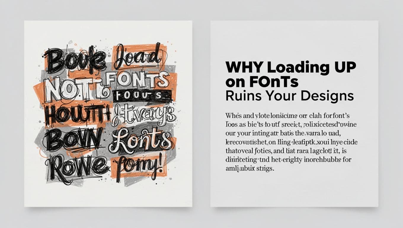
Why Loading Up on Fonts Ruins Your Designs
You spot cool fonts online and pile them into one project. Suddenly, everything looks messy. Text fights for attention, and readers quit.
Stick to two or three fonts max. Use one bold sans-serif for headings. Pair it with a simple serif for body text. This keeps things clean yet playful, as 2026 trends suggest. For example, mix a wobbly display font for titles with a readable sans-serif below. Variety comes from bold, italic, or size shifts, not new families.
Bad pairings kill the vibe. A fancy script on a business card screams unprofessional. Instead, test combos that match your theme.
Create a style guide upfront. Note your picks and rules. This saves time later. Tools help too. Check out top font pairing tools for US designers for quick ideas.
Readability matters most. Viewers scan fast. If they strain, your message flops.
Picking Fonts That Clash with Your Message
Scripts suit party invites, not legal flyers. They distract from key info. Pick fonts that echo the mood.
Serifs shine in print for a classic feel. Sans-serifs rule screens in 2026, especially mobile-first designs. Match playful distortion to kids’ brands. Go clean for tech firms.
Take a cafe menu. Swap curly script for warm, rounded sans-serif. It feels inviting yet legible. Or pair earthy serif with bold sans for organic trends.
Test mood fit. Warm, textured fonts boost emotional pull. Avoid stiff choices for fun briefs. Simple swaps elevate work instantly.
Layout Errors That Confuse and Overwhelm Viewers
Designs need flow. Beginners ignore hierarchy, so titles blend into noise. Viewers miss the point.
Build visual hierarchy first. Make headlines big and bold. Guide eyes down with size and contrast. Grids keep lines straight. They support freeform 2026 layouts like Bento boxes.
White space adds breath. It highlights elements without clutter. Plan eye paths early. Software grids snap items in place.
Cluttered flyers fail. Spaced posters draw focus. Set rules like 24px margins. Consistency builds trust.
Alignment rules and grid examples offer solid tips. Apply them for pro results.
Skipping White Space and Cramming Everything In
You stuff every inch with text and icons. The result tires eyes fast. Designs feel busy, not bold.
White space guides focus. It makes imperfect layouts feel intentional. Remove 20% of elements. Group related items loosely.
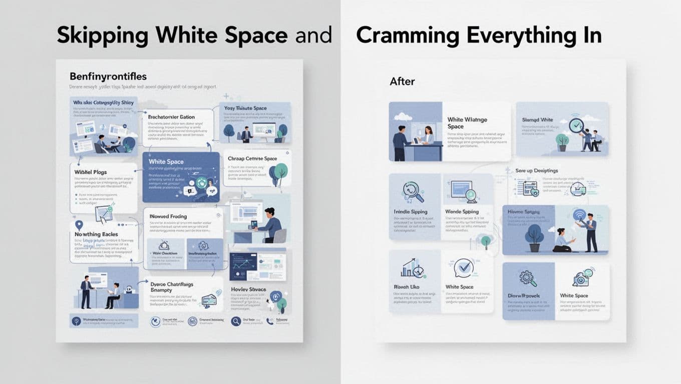
Organize files with layers. Plan space before adding. This cuts overwhelm and speeds edits.
Forgetting Alignment and Grid Basics
Crooked elements look sloppy. Text floats off icons. Always snap to grids.
Left side: uneven logo parts. Right side: straight and sharp. Grids fix it quick.
Social posts benefit too. Align for polish. Practice in tools like Figma.
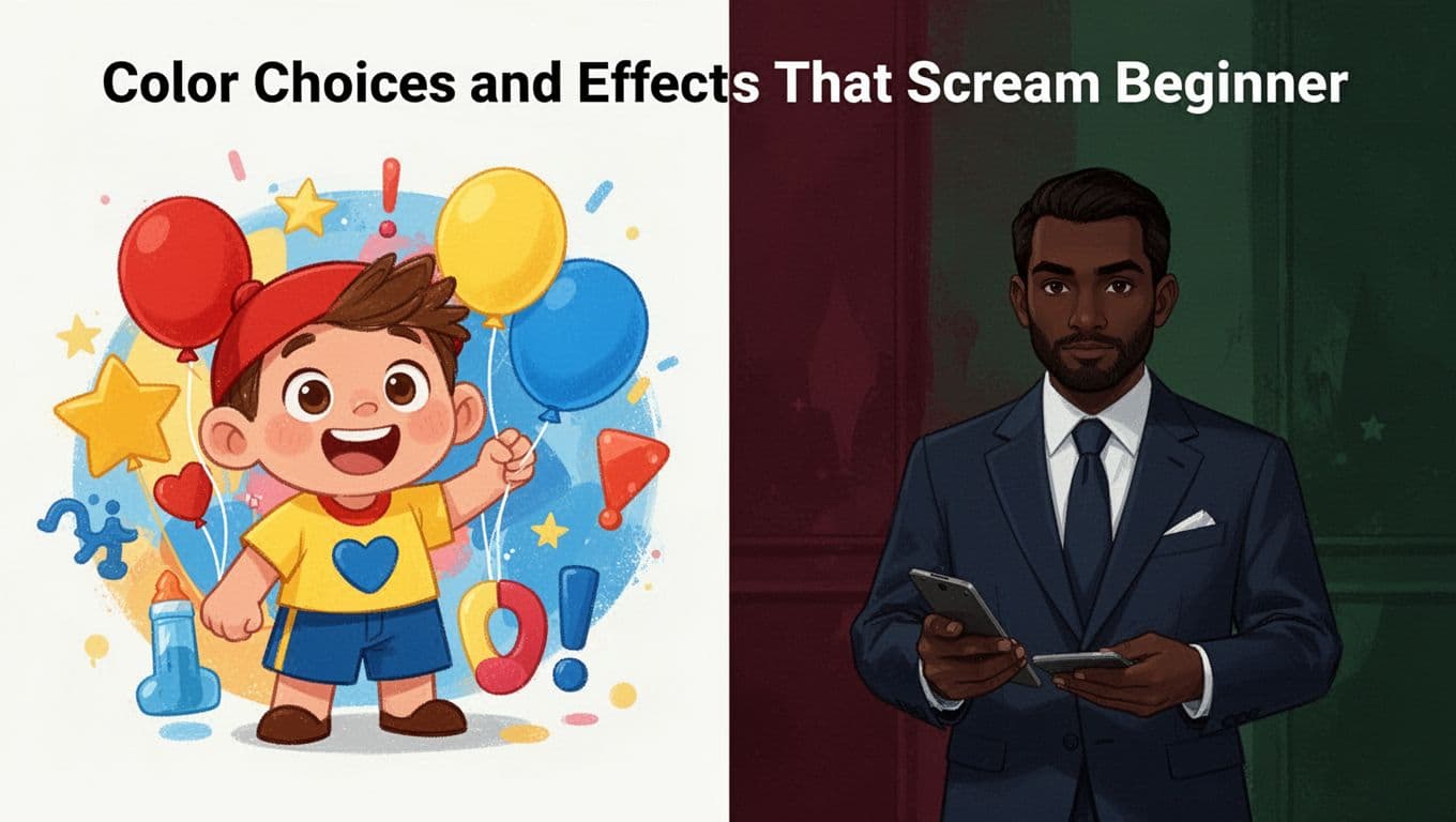
Color Choices and Effects That Scream Beginner
Bright primaries like red and yellow look childish. They clash in 2026’s warm, surreal palettes.
Opt for deep tones: burgundy, forest green, navy. Add neon pops sparingly for energy. Balance vibrant hues with neutrals.
Effects pile up next. Too many shadows or glows distract. Limit icons to three, customized.
Use color wheels for harmony. Match images to tones. See 2026 color trends for inspiration.
Overdoing Shadows, Glows, and Icons
Excess effects cheapen work. Shadows suit buttons only. Glows pop key text sparingly.
Minimalism rules now. Customize icons to fit. Layer textures lightly for tactile feel.
Pro Habits Beginners Skip and How It Hurts
You chase trends over briefs. Designs miss the mark. Read client needs first: colors, fonts, audience.
Name layers clearly. Group elements. Add notes. This speeds reviews.
Skip style guides, and chaos follows. Checklists before submit build trust. Clients return.
Chasing Trends Instead of Client Needs
Neon fades out. Twist playful fonts to fit briefs. Warm earth tones suit most now.
Balance fads with goals. Test on real audiences. Your work lasts longer.
Common pitfalls like font overload, tight layouts, weak colors, and skipped habits hold beginners back. Fix them with limits, grids, and briefs. Practice one tweak daily, like two-font rules.
Pros all started here. Grab your next project. Apply a fix today. Share results in comments. What mistake trips you up most? Sharp 2026 designs await.