Picture this. You launch a new website full of excitement. Visitors arrive, but they squint, bounce off fast, and never convert. Why? Clashing, eye-tiring colors that scream instead of invite. Poor color choices wreck user experience, erode brand trust, and slash conversions by up to 3% in key industries like finance or e-commerce.
Data backs it up. Low contrast hits 83.6% of homepages, making text a chore to read. Color blindness affects 8% of men, hiding your “Buy Now” buttons. Fix poor color choices in design now, and watch engagement rise 12-18%. You’ll spot issues, craft smart palettes, and tap 2026 trends like earth tones.
Ready to turn clashing chaos into calm confidence?
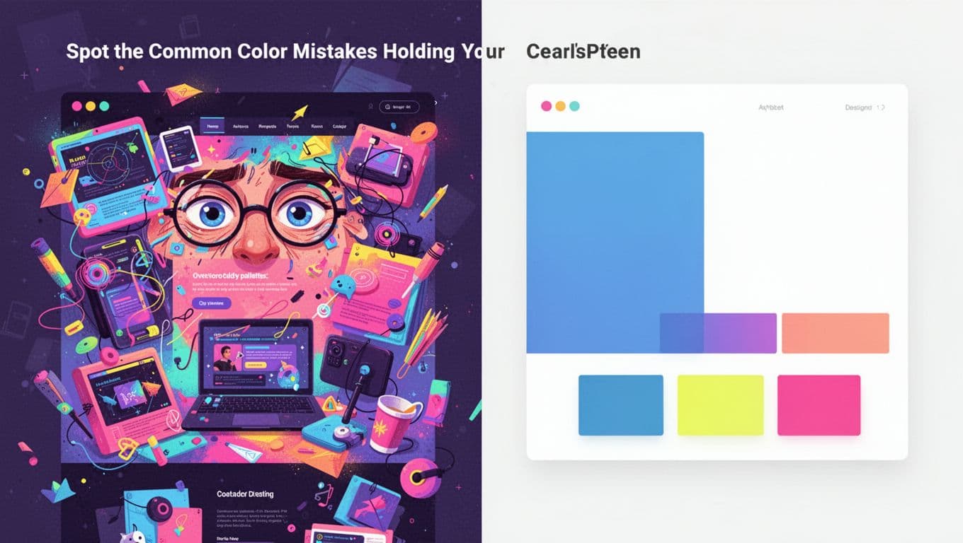
Spot the Common Color Mistakes Holding Your Designs Back
Designers often chase trends without checking basics. As a result, projects flop. In 2026, data shows overloaded palettes and ignored accessibility top the list. Start your fix by auditing these pitfalls. Ask yourself: Does this match the mood I want? Let’s break them down.
Overloaded Palettes and Eye-Straining Brightness
Too many bright, saturated colors overwhelm viewers. Neon pinks, limes, and purples fight for attention. Eyes tire fast, so users leave. One skincare site softened hues and boosted sales 19%.
Keep it simple instead. Pick one main color, add 1-2 accents, and lean on white space. A finance app uses navy as primary with soft yellow highlights. It feels pro and restful. Test your work: Step back 10 feet. Still easy on eyes? Good.
Besides, 2026 favors balance. Overdo saturation, and your graphic looks dated. Limit to three hues max.
Missing Contrast and Readability Issues
Low contrast kills readability. Gray text on white backgrounds blends in. Vision-impaired users struggle most, but everyone does in bright light.
WCAG sets clear rules. Aim for 4.5:1 ratio for normal text (AA level). For larger text, 3:1 works. One study found this issue on over 80% of sites.
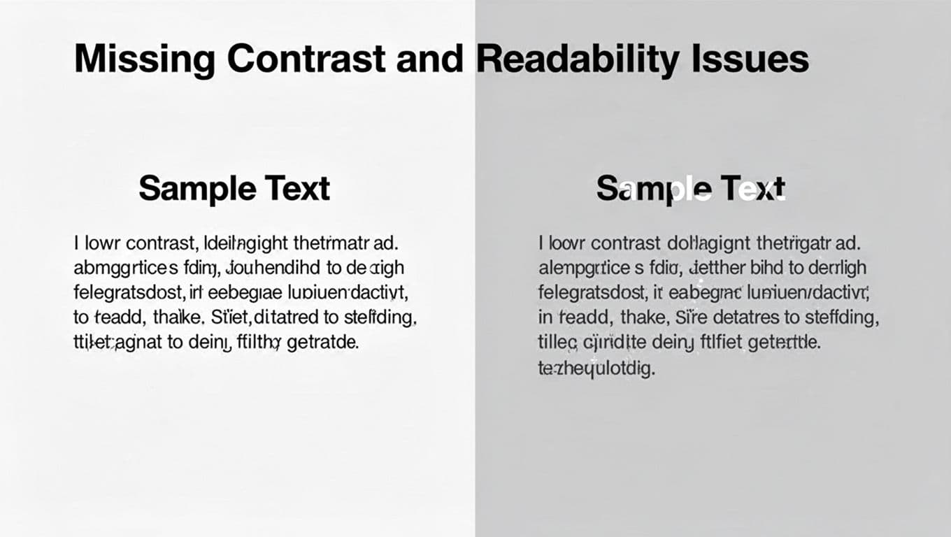
See the fix? Dark text on light backgrounds pops. Use tools to check. For details on ratios, see this WCAG color contrast guide. Small tweak, big win for UX.
Brand Mismatch and Audience Blind Spots
Colors must fit your brand story. Red means excitement in the US, but danger elsewhere. Banks pick blue for trust. Ignore that, and you confuse users.
Audience matters too. Older viewers prefer softer tones; youth like bold pops. Culture shifts views: Green signals go in the West, but signals death in some Asian spots.
Self-audit: Does teal suit your eco brand? Or clash? One e-commerce site mismatched pinks with serious products. Sales dropped. Align hues to values first. Then refine.
Build a Color Palette That Works Every Time
You spotted the issues. Now build better. Start with your goal: What emotion do you want? Calm? Energy? Follow these steps for harmony every time.
First, limit to 3-5 colors. Ensure contrast meets WCAG. Use proven schemes like analogous (next to each other on the wheel) for calm flows.
Real example: A coffee shop app uses warm browns (analogous) for coziness. No chaos.
Pick Colors Based on Mood and Brand Story
Decide the feeling first. Blue calms; orange excites. Match your brand. Finance? Stick to reliable navy or green.
Don’t pick randomly. List emotions: Trust, fun, urgent. Then search palettes. A travel site chose sunny yellows for adventure. Users felt the vibe instantly.
Test against logo and voice. Does it reinforce? If not, swap. This avoids mismatches from before.
Next, factor audience. Gen Z loves neons sparingly; boomers want neutrals. Data shows industry tweaks lift conversions 2-3%.
Create Harmony with Proven Pairings
Harmony comes from the color wheel. Analogous colors sit side-by-side. They blend smooth, like blues and greens for ocean sites.
Complementary sit opposite. They pop: Blue and orange for calls-to-action. Use accents only.
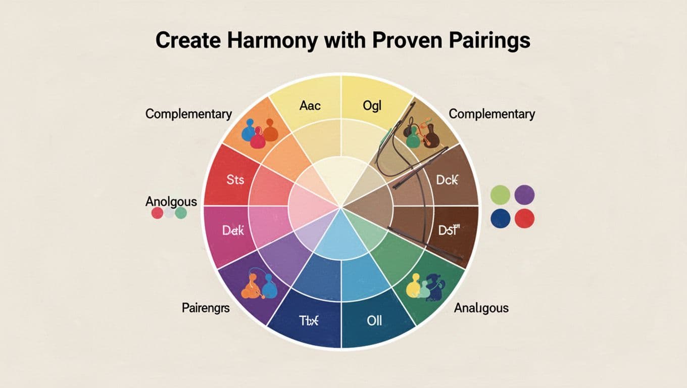
Start here. Pick a base, add neighbors or opposites. Dual-tone works: 60% main, 30% secondary, 10% accent. A UI redesign used teal analogs; engagement soared.
Avoid clashes. Preview in your tool. Harmony fixes overload fast.
Test, Refine, and Trend-Proof Your Colors with 2026 Tools
Palettes ready? Test them. Tweak saturation down 10-20% for less strain. Run accessibility scans. Gather feedback.
Tools speed this. Palette generators suggest harmonies. A/B test on users. Trends evolve, so adapt smart.
Run Accessibility and Harmony Checks
Check contrast first. Free tools like WAVE spot issues. Simulate color blindness with Color Oracle.
Steps:
- Export palette hex codes.
- Paste into checker.
- Fix fails by darkening text or lightening backgrounds.
For generators, try top tools for 2026. They bake in WCAG. Audience test: Share mocks. “Easy to read?” Adjust based on replies.
This catches blind spots early.
Tap into Fresh 2026 Trends Like Gradients and Earth Tones
2026 shifts to real feels. Ditch stark whites for Transformative Teal or mocha tones. WGSN calls teal pivotal for eco vibes.
Earth tones like jade green, rich purple, verdant ochres add warmth. Pair with soft gradients for depth, not flatness.
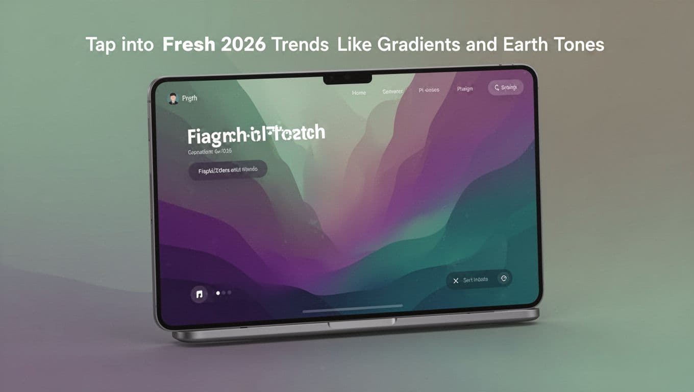
See how gradients layer? They fix overload by guiding eyes. Use neons as accents only. Nature palettes connect users, boosting trust. Don’t copy blindly; fit your brand. Test in context.
Your designs stay fresh.
Spot mistakes like overload or low contrast. Build mood-driven palettes with wheel harmonies. Test via tools and trends like teal gradients.
Audit one project today. Better colors mean higher engagement and sales. Share your before-and-after in comments. What fix surprised you most?
Subscribe for more design tips. Your next project could shine color-perfect.