Picture this. You spend weeks on an app design. You add slick animations, extra buttons, and bold patterns. Users open it and bounce right away. Confusion sets in because they can’t find the main action. This happens too often in design work.
Overcomplicating designs kills user experience. It slows projects and frustrates everyone. In March 2026, with fast mobile use and short attention spans, busy layouts spike bounce rates. Stats show cluttered sites see bounce rates jump 32% from slow loads alone. Users abandon 53% of mobile pages over three seconds, often due to visual mess.
You don’t need more features. You need focus. This post shows you how to spot clutter traps, apply quick fixes, tap 2026 trends, and compare real examples. Follow these steps for cleaner designs that users love and projects finish faster.
Spot the Red Flags That Your Design is Getting Too Busy
Designers add extras without thinking. Soon, clutter takes over. Common signs include too many colors or fonts, no white space, and wrong scales. These mistakes overwhelm eyes and slow sites.
For instance, websites with chaotic elements lose visitors quick. Recent data notes 61% of users switch sites if they can’t find info in five seconds. Your project might suffer the same fate.
Check your work now. Does it feel packed? Busy designs fail because they distract from the goal.
Cramming Too Many Colors, Fonts, or Patterns
Mix six fonts and wild colors. Your page looks like a ransom note. One site I saw used rainbow hues and script type everywhere. It screamed amateur.
This setup distracts users. Eyes jump around on mobile screens. Messages get lost. Limit to two or three fonts and a simple palette that fits your brand.
Tools help pick colors fast. In addition, consistent choices build trust.
Forgetting White Space and Balance
Pack elements tight like a crammed poster. No room to breathe. Think of a living room stuffed with furniture. Chaos rules.
White space guides eyes naturally. Without it, designs feel heavy. Sites from Halcyon Web Design show how space fixes clutter. Add gaps between items for focus.
Balance comes next. Center key parts. Users stay longer as a result.
Misjudging Scale or User Fit
Furniture looks tiny in a big room. Or art hangs too high. Designs ignore this too. Mobile sites with huge buttons flop on phones.
Test sizes early. Measure for real devices. Poor fits raise frustration. Users expect smooth paths across screens.
Easy Fixes to Simplify Your Workflow Right Now
Shift to action. Start simple each time. Prioritize user needs and cut extras. These steps speed projects and boost results.
Less is more for pros. You gain happier users. Implement one today for quick wins.
Begin with One Clear User Goal
Ask the real goal first. Build only for that. AI tools generate basic UI from prompts. This drops 80% of fluff.
Write one sentence on intent before sketches. For example, “Help users book a ride fast.” Everything serves this. Fluff vanishes.
Focus sharpens your work. Projects finish quicker.
Stick to a Tight Color and Font Palette
Choose two fonts max. Pair with three colors. Use them everywhere for unity. A simplified site pops on phones.
Try Coolors for palettes. Match brand voice. Consistency makes designs pro.
Users scan easier. Engagement rises as a result.
Add Space and Test Proportions Early
Leave breathing room around elements. Test on graph paper or phones. Hang art at eye level. Apply same to layouts.
Print sketches. Or prototype in Figma. Check devices. Proportions feel right.
Fixes early save time later.
Leverage 2026 Trends for Designs That Stay Simple Automatically
Trends in 2026 keep things lean. Generative UI and calm styles prevent bloat. No extra effort needed.
These shifts adapt to users. Ethical tests ensure privacy. Designers win big.
Exciting changes ahead. Apps like Spotify tweak for weather. Yours can too.
Check UX/UI Trends 2026 for more.
Let Generative UI Build What Users Need
AI crafts screens on demand. It drops unused parts. Interfaces stay lean.
Task layouts adapt. No static bloat. Users get what fits.
Simple becomes default.
Go Context-Aware to Show Only What’s Relevant
Designs shift by device or time. Show minimal for quick tasks. Like Spotify moods.
Offer reduced motion. Clutter stays away.
Users focus better.
Adopt Calm Design for Focus Without Fatigue
Subtle interactions rule. Soft shadows, one-color depth. No flash overloads.
Neumorphism adds touch feel. Balances senses. Success rates climb 35%.
Stress drops for users.
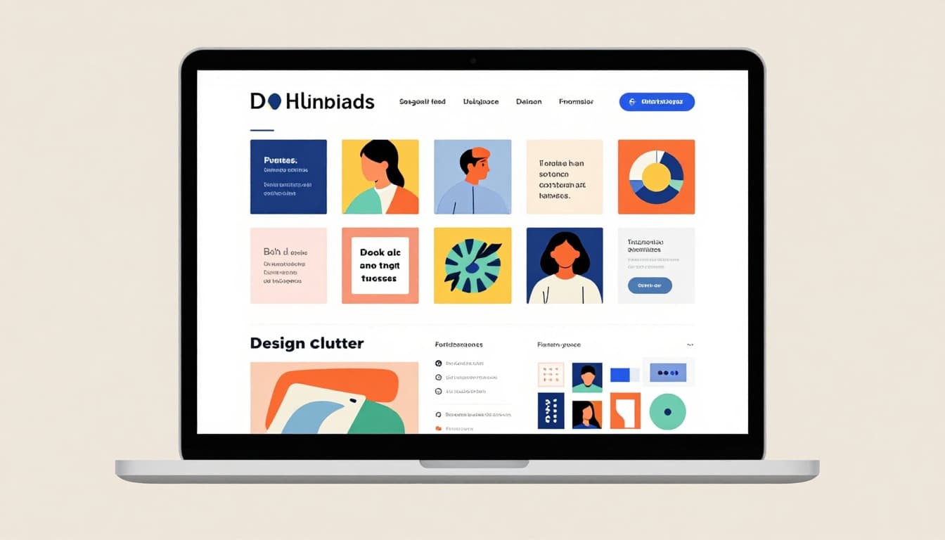
See the Difference: Overcomplicated vs. Simplified Designs
Compare side by side. Clutter fails fast. Simple wins trust.
Here’s a quick table of examples:
| Scenario | Overcomplicated Issue | Simplified Win |
|---|---|---|
| Living Room | Furniture crammed, no flow | Space between pieces, clear paths |
| Website | 10 fonts, busy banners | Two fonts, white space highlights call-to-action |
| Poster | Overlapping text, wild patterns | Bold headline, balanced images |
| Gallery Wall | Uneven scales, too many frames | Eye-level alignment, grouped neatly |
Overcomplicated versions confuse and slow loads. Simplified ones breathe. They guide eyes and load quick.
Audit your projects now. Pick one to simplify.
Ready to Simplify?
Spot red flags like color overload or no space. Apply fixes from clear goals and tight palettes. Embrace 2026 trends such as generative UI. Examples prove simple outperforms busy.
Simplicity builds trust, speed, and engagement this year. Users stick around. Projects wrap on time.
Pick one tip today. Simplify a current design. Share your before-and-after in comments. What changed for you?
Simple designs change everything. Check minimalism posts next for more ideas.