
You’ve stared at an app that buries its best features in endless menus, right? Pop-ups bombard you before you even see value, and buttons act like tricks, leaving you lost and tapping the delete button. Meanwhile, a simple app like one with a quick onboarding tour shows exactly what to do first, so you stick around and get results fast. Bad designs fail users; good ones guide them effortlessly.
That’s how to think like a graphic designer. You start with empathy for what people need, mix in creativity, and sharpen your eye for visuals that click. No art degree required. You gain better emails and presentations at work that win people over, intuitive setups at home that save time, or side projects that look pro and spread fast.
In this step-by-step guide, we’ll break down the key habits: spot user needs first, simplify without losing impact, build consistency, and test what works. Ready to see the world through a designer’s eyes?
Shift to a Designer’s Curious and User-Focused Mindset
Designers train their brains to spot details others miss. They watch user behaviors, not just personal tastes. This shift builds sharper problem-solving skills for emails, menus, or apps. You notice a busy mom squint at a cluttered flyer. Or a friend fumble with tiny buttons on a site. Those moments reveal real needs.
Key mindsets drive this: put yourself in users’ shoes through close observation. Run quick tests and learn from flops. Stay open to wild ideas that spark fresh solutions. Always design for actions people actually take, like grabbing a coffee mid-rush. Take a messy kitchen menu. You see families skip it because fonts clash and sections overload. Redesign it with bold icons and short lines. Now they order fast and happy. This mindset works anywhere because it cuts guesswork. Problems solve themselves when you focus on people first.
Practice daily to build it. Sketch strangers in cafes; note their frustrations with signs or screens. Jot habits like rushed glances or confused pauses. In short, turn curiosity into your superpower.
Build Empathy by Understanding What Users Really Need
Start with empathy. It’s step one because designs fail without it. Talk to people. Watch them struggle. Note emotions and habits up close.
Picture researching a poster for busy parents. You spot one at a park bulletin board. She juggles a toddler, phone buzzing, eyes glazing over tiny text and faded colors. Jot it: frustration builds in 10 seconds. She walks away without reading events.
Avoid assumptions. They lead to pretty but useless work. Use quick chats or surveys instead. Ask three questions: What frustrates you here? What grabs your eye first? How can this help right now?
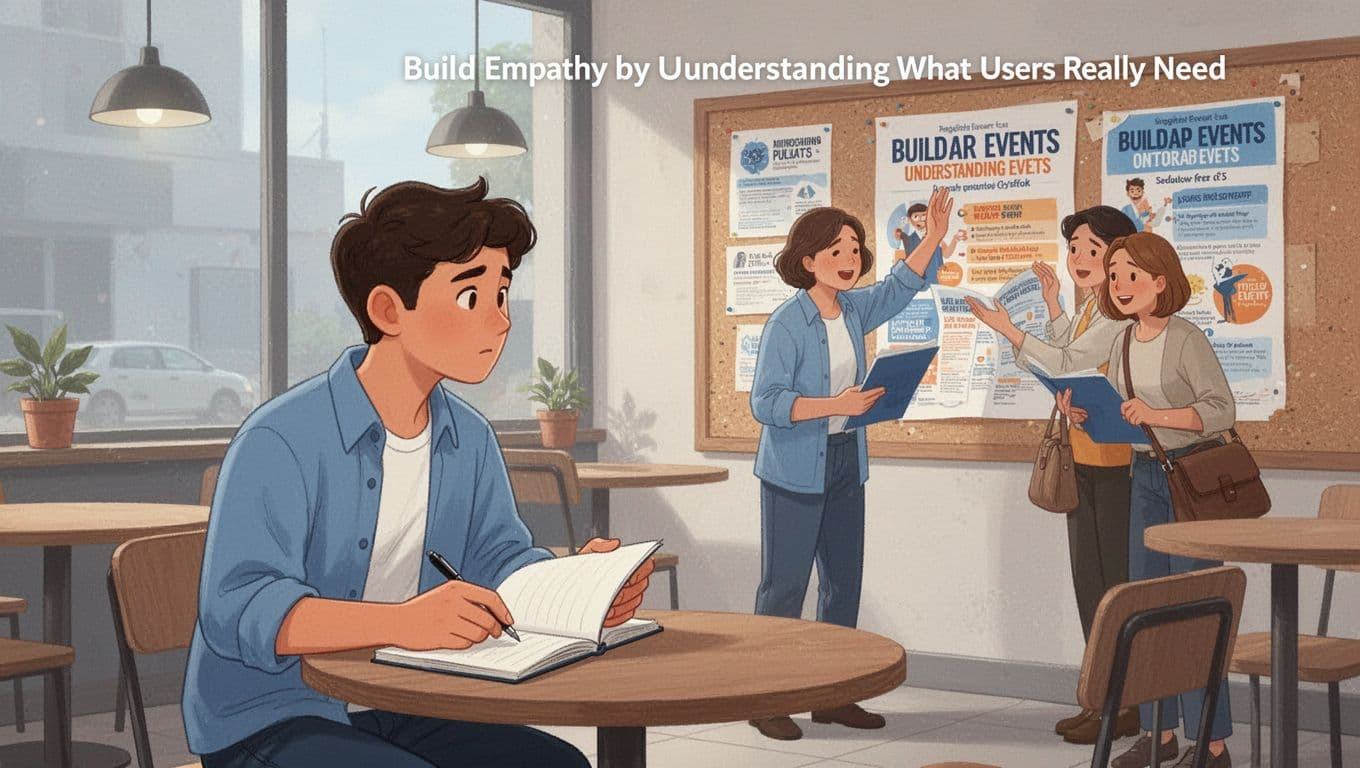
This empathy ties straight to graphic design. You end up with bolder fonts, high-contrast colors, and one key message. Parents scan, smile, and sign up. For deeper tips on tools like empathy maps for user research, check practical guides. Results? Visuals that connect and convert.
Embrace Quick Experiments and Learn from Failures Fast
Next, iterate fast. Perfection stalls you; speed builds agility. Sketch rough ideas. Test with friends. Tweak based on real feedback.
Consider a logo flop. It prints muddy gray on business cards. Friends say it blends into backgrounds. You swap to vibrant blues, test prints again. Now it pops. One change fixes it.
Here’s how to do it:
- Grab paper and markers for 10-minute sketches.
- Share three versions; ask what works and why.
- Adjust colors or layouts in five minutes.
This beats endless planning. Failures teach quick. A wild idea might flop, but the next tweak shines. As a result, your designs adapt to real use.
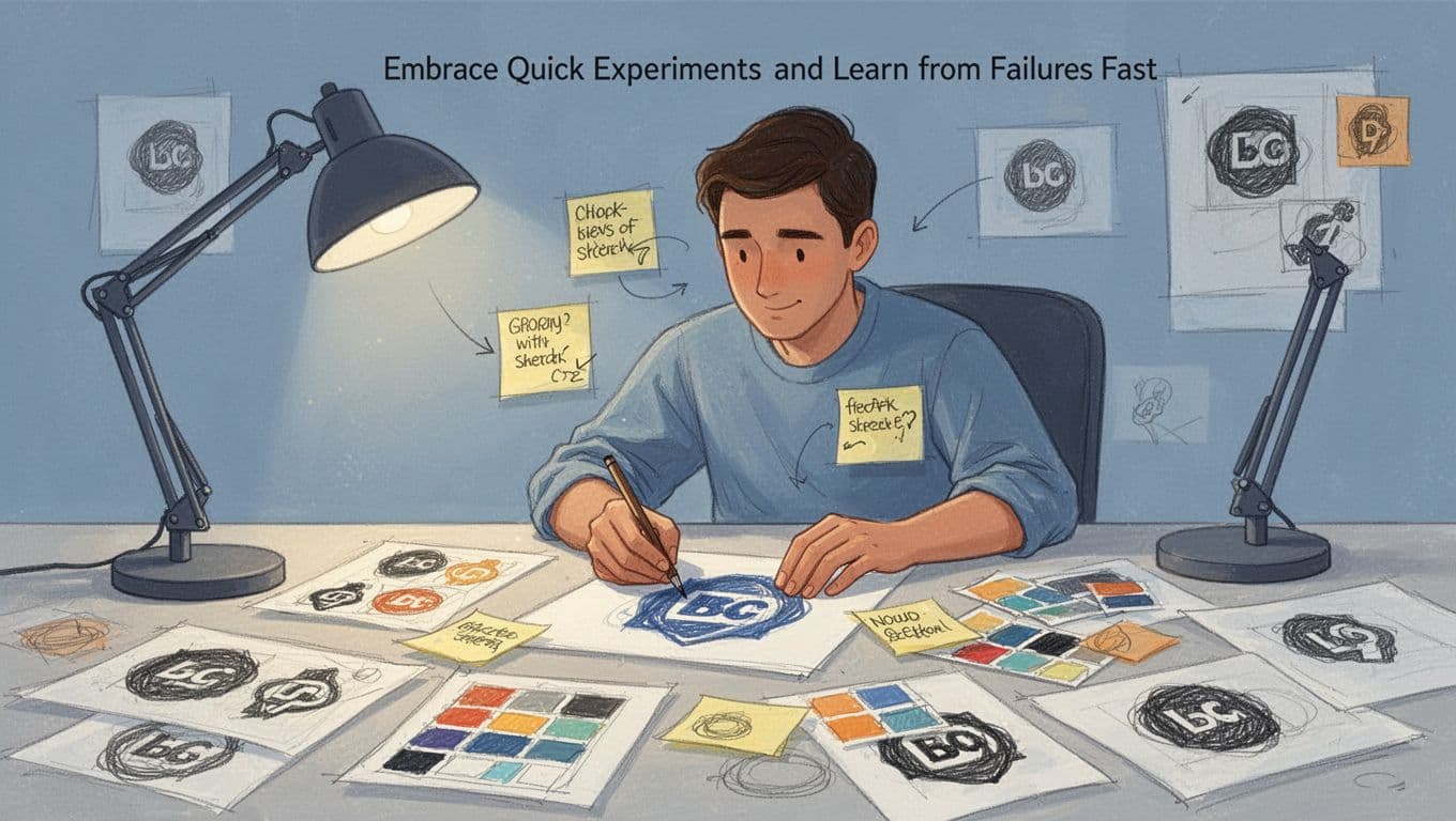
Stay open to crazy concepts too. Doodle a menu as a comic strip for that kitchen. Test it; families laugh and read every item. Design for actions like quick scans during dinner prep. Therefore, your work solves problems others ignore. Practice this, and everyday tasks turn pro-level.
Master the Step-by-Step Process Designers Use Every Time
Designers follow a tight loop called design thinking. It keeps projects structured but sparks creativity. You cycle through empathize, define, ideate, prototype, test, and implement as needed. This works for logos, emails, or social media graphics. Let’s use one example: a workout graphic for a fitness app’s Instagram post. It draws gym-goers in fast. Repeat this cycle, and your designs hit home every time.
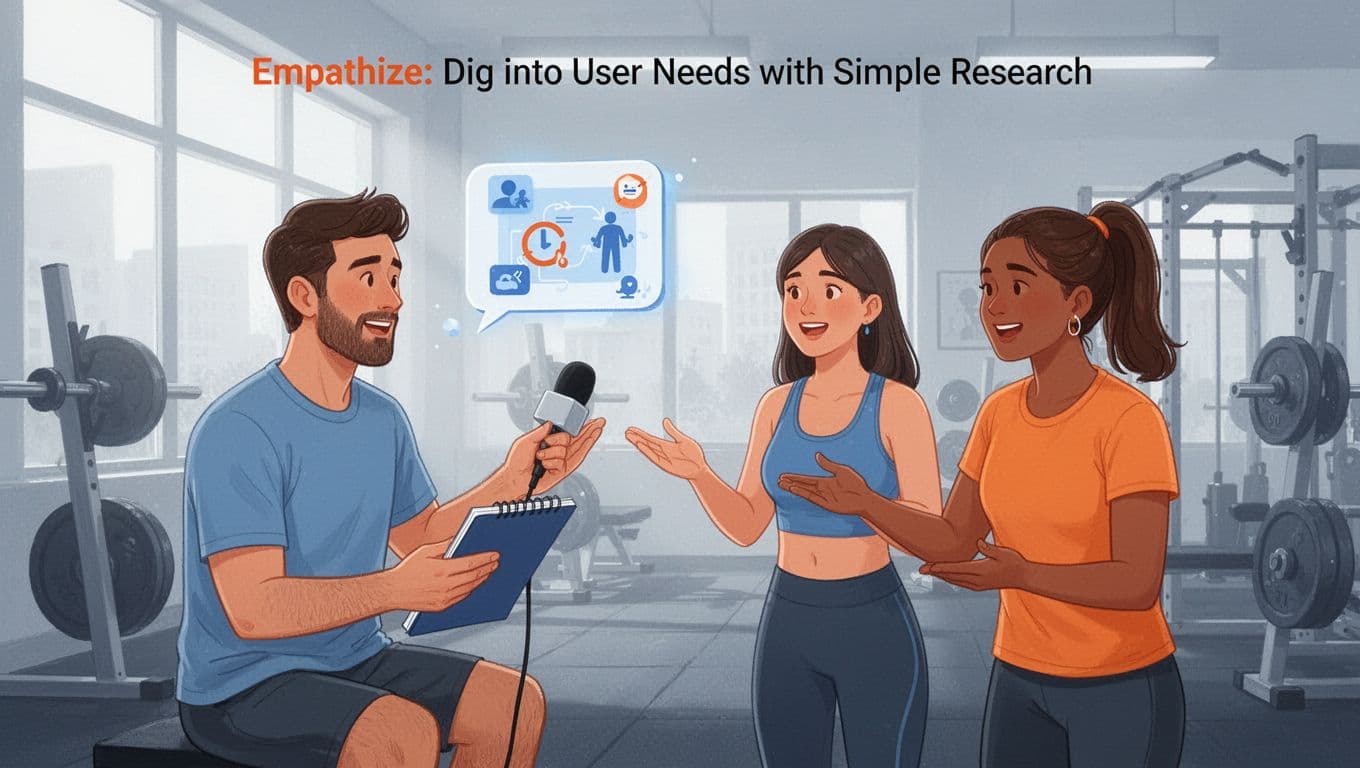
Empathize: Dig into User Needs with Simple Research
Start by getting close to users. Chat with them, map their journeys, and check competitors. Interviews reveal raw truths. For the fitness graphic, head to a gym. Ask five gym-goers: “What stops you from trying new workouts on social media? What colors or images pull you in?”
User journeys show the path. Sketch their day: wake up rushed, scroll feed during coffee, skip boring posts. Competitors? Scan top fitness accounts. Note bold action shots that pop versus flat stock images that flop.
These tricks build real insight. In addition, tools like Stanford d.school’s empathy planner speed it up. You spot pain points fast, so your graphic motivates scrolls into saves.
Define: Nail Down the Exact Problem to Solve
Now boil insights into one clear problem. Write a statement like: “Gym-goers need quick workout visuals that spark energy on busy feeds because bland posts get ignored.” Vague goals like “make it pretty” waste time. Specific ones guide every choice.
Group your notes first. Cluster quotes: “Too many words,” “Want real sweat vibes.” Then craft the “who, need, why” formula. This sharpens focus. As a result, you skip distractions.
For the fitness graphic, this means bold images over text walls. Check Interaction Design Foundation’s guide on problem statements for more examples. Your designs solve real issues now.
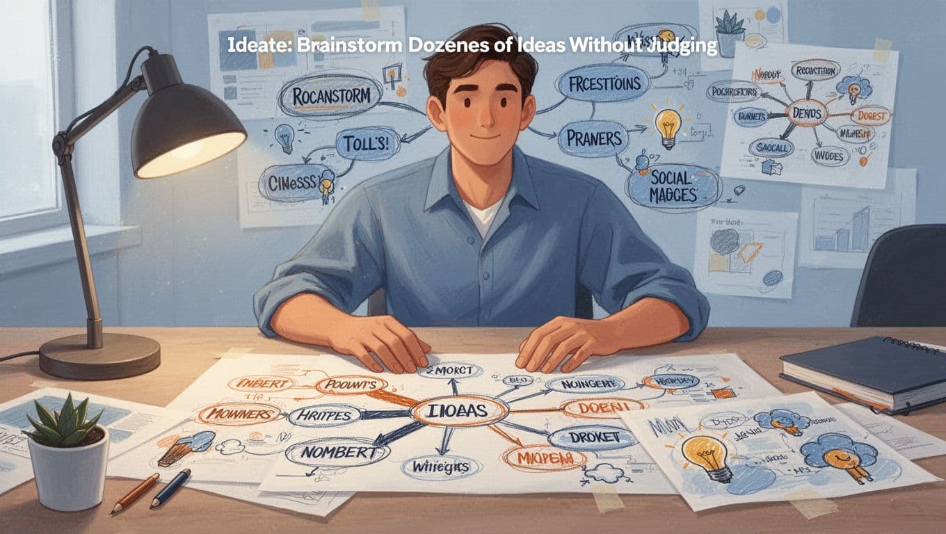
Ideate: Brainstorm Dozens of Ideas Without Judging
Pump out ideas fast. Aim for 50 sketches in 20 minutes. Use mind maps from a central word like “sweat.” Branch to “pump iron,” “quick HIIT,” “neon glow.” Add word associations: energy, pulse, fire. Doodle wild: exploding dumbbells, runner shadows.
Set a timer for bursts. No critiques yet; quantity breeds gems. Paper works best at first. Then refine top picks.
This frees creativity. For instance, mind mapping tutorials for designers show how. Your fitness graphic might land on a pulsing heartbeat border that screams “join now.”
Prototype and Test: Build Rough Versions and Get Feedback
Build quick mocks. Use paper for thumbnails or Figma for clickable ones. For the graphic, sketch three: neon text over a jumper, minimalist icons, animated sweat drops. Keep it low-fi to focus on basics.
Test with five users. Share links or prints. Ask: “Does this grab you? What confuses?” Note frowns at weak spots. Iterate twice: amp colors, cut clutter.
Figma’s low-fidelity prototyping tips make it simple. Feedback turns good into great. Post the winner; watch engagement soar. Loop back if needed, and implement.
Apply Visual Principles That Make Designs Pop Instantly
Designers rely on core visual rules to grab attention and guide users right to the point. These principles, often called CRAP (contrast, repetition, alignment, proximity), work with hierarchy, balance, and white space. They turn chaos into clarity. You don’t need fancy software. Tools like Canva or PowerPoint let anyone apply them fast. Best part? They keep users focused on key info, like a call-to-action button or main headline. Start with basics from color theory: pair warm tones (reds, oranges) for energy against cool backgrounds (blues) for calm. Now let’s break them down.
Guide Eyes with Hierarchy, Contrast, and Smart Alignment
Hierarchy sets order. Make big, bold elements the stars so users spot them first. Then use contrast to make them pop: dark text on light backgrounds or vice versa. Alignment keeps everything tidy; no floating bits that confuse the eye.
Take a cluttered flyer. Small fonts blend together, low contrast hides the title, and text floats randomly. Users scan and quit. Fix it with a huge bold headline in black on white. Align all text left. Smaller subheads follow in consistent gray. The title jumps out now.
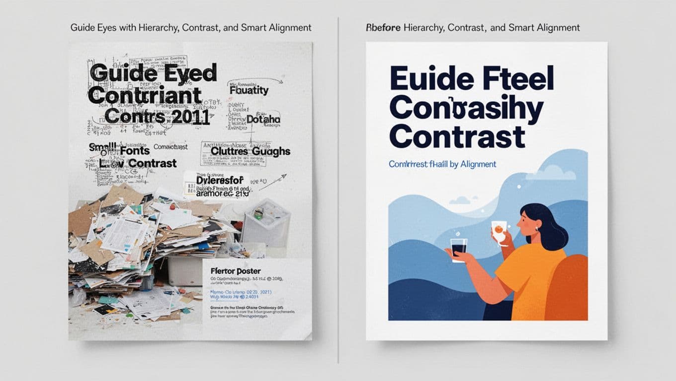
In Canva, drag your title to the top grid line. Boost size and add a shadow for depth. PowerPoint? Select text, crank font weight, and snap to guides. For more on these basics, see design fundamentals from Presentation Zen. Users follow your lead because eyes hit the important stuff first. As a result, they act faster.
Create Flow with Balance, Repetition, and Breathing Room
Balance spreads visual weight evenly, so nothing tips over. Repetition uses the same colors or fonts to unify. Proximity groups related items close; white space adds breathing room to prevent cram.
Cluttered designs overload one side with text blocks and icons scattered far. Users feel lost. Balance it: mirror shapes left and right, or offset with color weight. Repeat your blue accent color on buttons and headers. Cluster event details together; add generous space around.
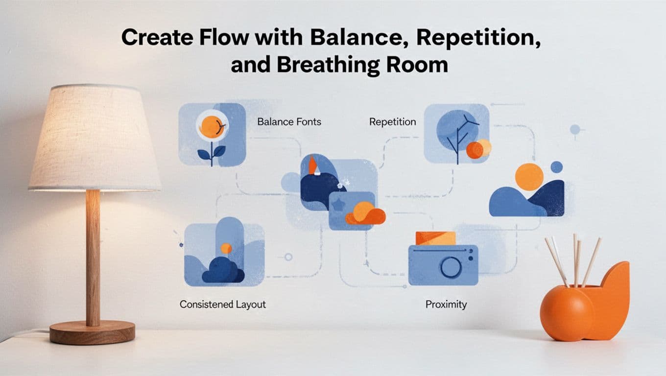
In PowerPoint, duplicate elements and align symmetrically. Canva templates snap items into balanced grids. White space shines here; it highlights stars without crowding. Proximity tells users what’s connected, like a price near its photo.
These rules tie back to users. They scan feeds in seconds, so flow pulls them through. Try this exercise: Grab a bad ad online, like a jammed-up sale flyer. Redesign in Canva. Apply one principle per tweak. Compare before and after. You’ll see clicks rise because eyes land exactly where you want.
Bring Designer Thinking to Life Today with Tools and Trends
You have the mindset, process, and principles now. Time to grab tools that make it real. Beginners thrive with free apps that handle the heavy lifting. So pick one, start small, and watch your ideas turn pro. Trends keep you fresh, but always edit AI outputs yourself. Empathy guides every click.
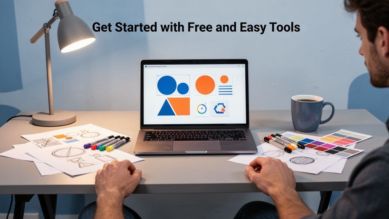
Get Started with Free and Easy Tools
Canva leads for drag-and-drop speed. It suits social posts or flyers right away. Figma handles team tweaks and prototypes next. Both offer free tiers packed with templates.
AI speeds things up too. Adobe Firefly generates images from prompts; type “energetic workout graphic” and refine it. Kittl adds trendy effects like grainy textures. Always human-edit for that personal touch.
Here’s a quick starter kit:
| Tool | Why It Fits Beginners | Key Features |
|---|---|---|
| Canva | Simple templates | AI edits, social graphics |
| Figma | Free collaboration | Prototypes, plugins |
| Kittl | Trendy one-click | Text effects, blur filters |
For full rankings, check 6 best free graphic design tools tested in 2026. These cut setup time, so you focus on user needs.
Jump on 2026 Trends That Amplify Your Work
AI prototypes fly fast, yet empathy rules because users crave real feels. Go for imperfect handmade styles: add grain or collages in Canva for that cozy vibe. Sustainable picks mean digital-first or recycled prints with earthy tones.
Inclusive visuals shine too. Use bold, clashing fonts from Google Fonts; test contrast for all eyes. Trends like 3D depth pop in Figma or Blender free versions. For example, AI tools boosting graphic design in 2026 show how they fit beginners.
Tackle Real Projects and Build Momentum
Redesign your resume first. Spot clutter, apply hierarchy, balance with white space. Or craft a business card: bold name, minimal icons, high contrast. Test on friends; tweak fast.
These build skills quick. Results boost confidence because your work solves real pains, like a resume that lands interviews.
Pick one project this week. Grab Canva, follow the process, share it online. You got this; designers start exactly here.
Conclusion
You now hold the graphic designer mindset. Shift to user focus, follow the design thinking process, and apply visual principles like contrast and balance. These steps unlock pro-level thinking for any project.
Sharper ideas flow because you spot needs first. Users stay happy; they act fast on clear visuals. Your emails, posts, or flyers convert better as a result.
Pick one step today, like a quick empathy sketch in Canva. Share your results in the comments below. For more tips, join our newsletter or check empathy maps for user research.
Now go think like a graphic designer and transform your world.