Imagine a flyer crammed with text and clashing colors. No one reads it. Now picture a clean poster with bold images that draws eyes and sells products fast. Graphic design turns chaos into clear messages that grab attention.
You create logos, websites, or social posts. These basic principles guide you. They make visuals work better. Balance, contrast, emphasis, movement, rhythm, unity, repetition, proximity, alignment, and pattern form the core ten. This post breaks them down. You’ll see why they matter, how groups team up with examples, real tips, and 2026 trends.
Why Learning Graphic Design Principles Will Transform Your Work
Designs look pro when you use these principles. They guide eyes smoothly. Audiences connect faster because everything feels right. Beginners often pack pages too full. Colors stay dull without purpose. Crowded work confuses people.
These ideas root in Gestalt theory. It explains how brains group visuals. Think of a well-organized kitchen. Drawers align. Items cluster by use. Billboards work the same. Bold text pops. Images balance space. You save time. Clients notice polish.
For deeper dives, check Figma’s guide to core principles. Practice them. Your work stands out.
Build Clear Foundations with Balance, Contrast, Emphasis, Alignment, and Proximity
These five principles organize designs. They make info scan fast. Viewers grasp ideas at a glance. Start here for solid bases. Examples show how they pair up.
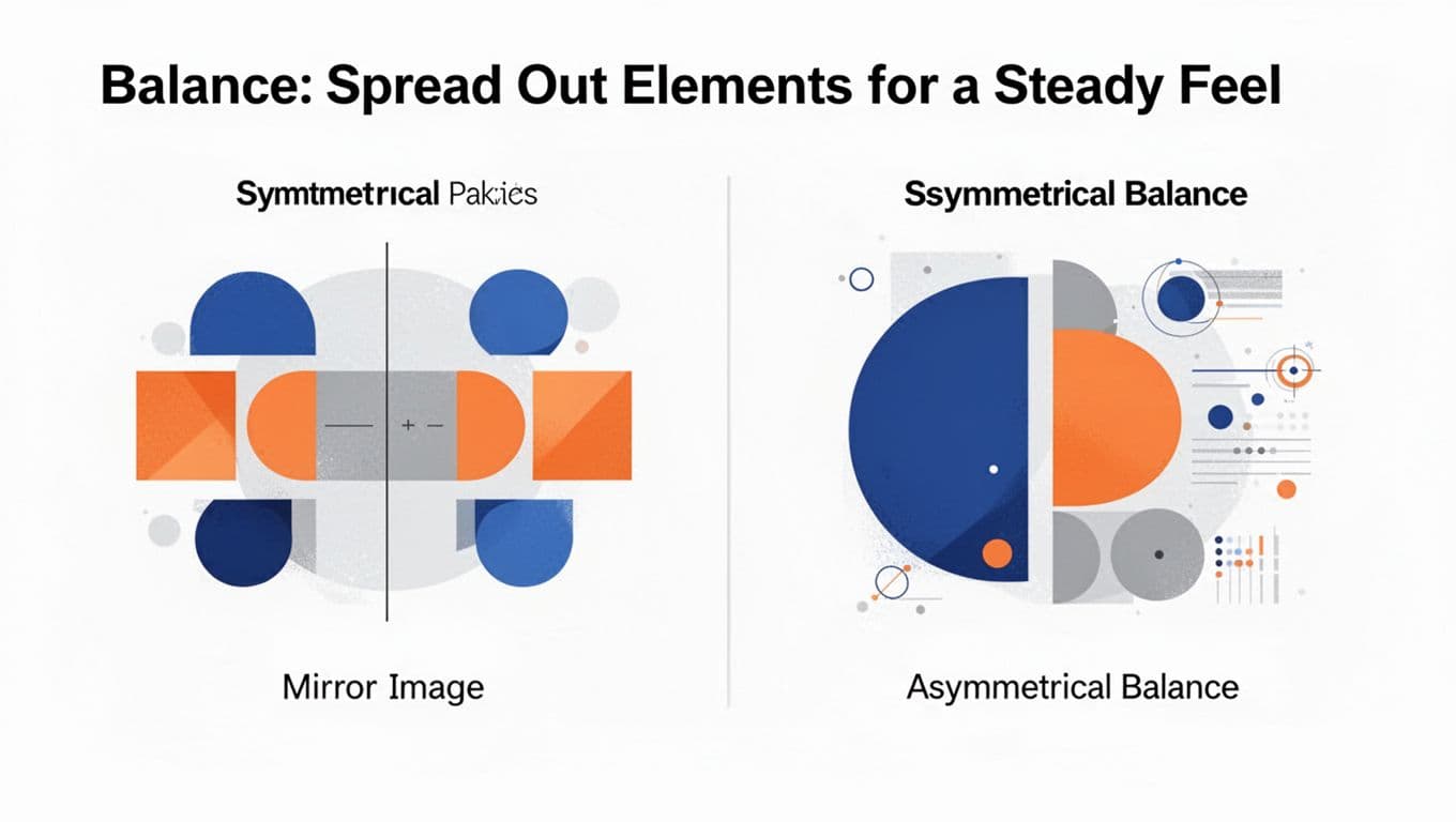
Balance: Spread Out Elements for a Steady Feel
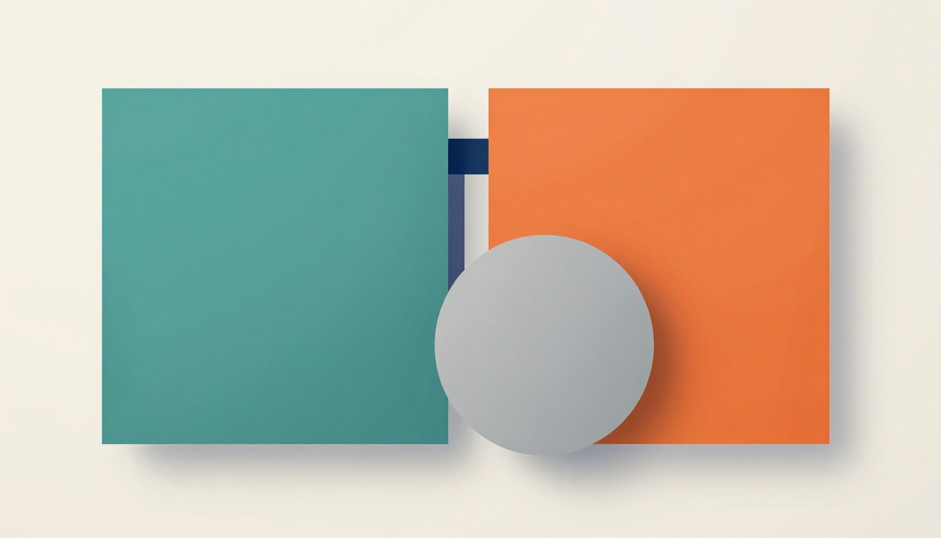
Balance evens visual weight. Nothing tips over. Symmetrical styles mirror sides perfectly. Equal shapes sit on a center line. Asymmetrical uses big forms offset by small clusters.
A logo often balances a thick icon with thin text. Tilt your head. Does it feel off? Fix by shifting elements. Unstable designs distract. Stable ones calm viewers.
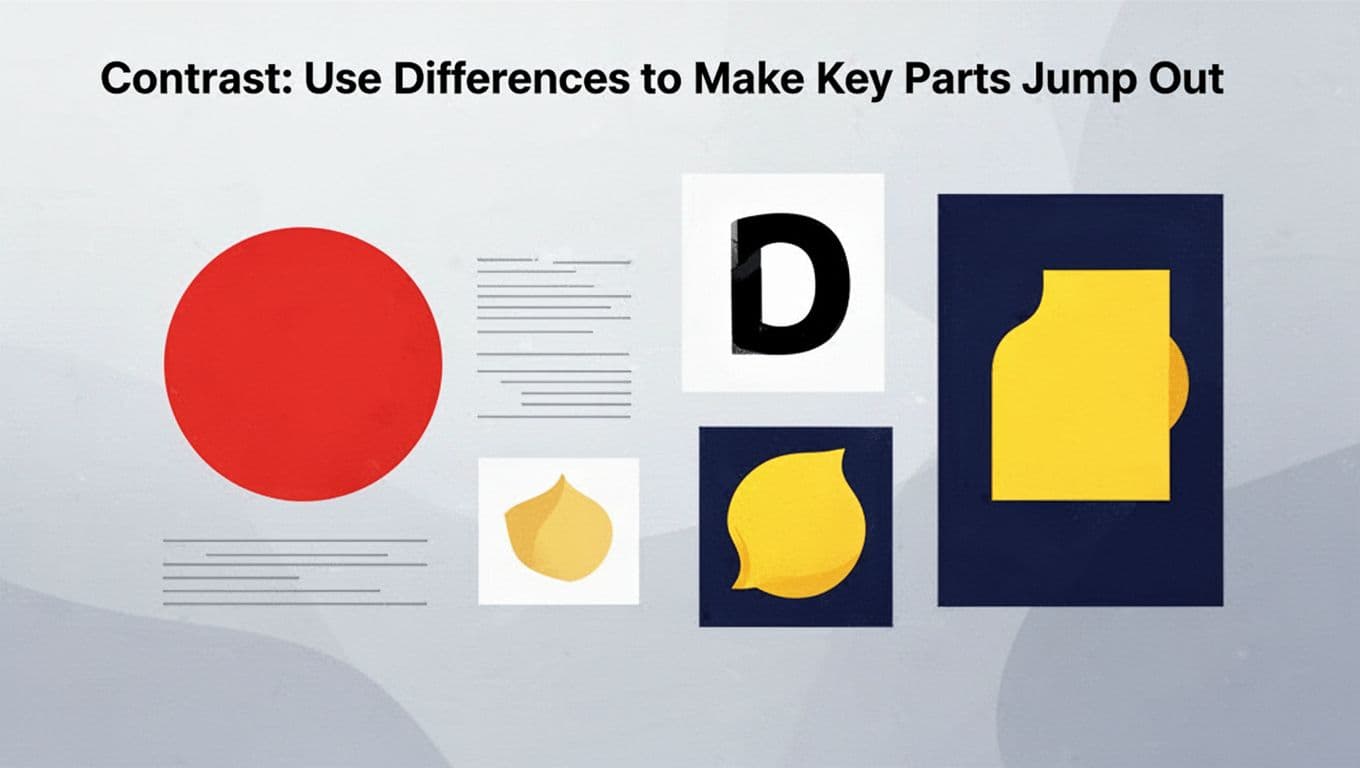
Contrast: Use Differences to Make Key Parts Jump Out
Contrast clashes sizes, colors, or shapes. It adds pop. A bold red button shines on white. Thick lines pair with thin ones. Excitement builds.
Squint your eyes. What stands out? Muddled designs blend. Strong differences guide focus. They pull viewers in.
Emphasis: Direct Eyes to the Star of Your Design
Emphasis spotlights the hero. Use size, color, or space. A huge headline grabs first. Bright icons follow. It sets reading order.
Product ads center key images. Limit to one or two focuses. Too many compete. Eyes know where to go.
Alignment: Line Everything Up for Pro Results
Alignment snaps to grids. No floating bits. Eyes follow clean paths. Text stacks left or center. It looks planned.
Paragraphs hug edges in magazines. Grab your ruler tool. Snap elements tight. Flow improves right away.
Proximity: Cluster Related Items to Tell a Story
Proximity groups friends close. Space strangers apart. Contact info huddles together. Menus sit under heads.
Chunk info this way. Brains link fast. Test spacing. Tight packs overwhelm. Loose ones confuse. Clear ties emerge.
Add Life and Flow with Movement, Rhythm, Unity, Repetition, and Pattern
These principles energize work. They tie pieces into harmony. Pair with the first group for full power. Chaos stays out. Exercises help beginners feel them.
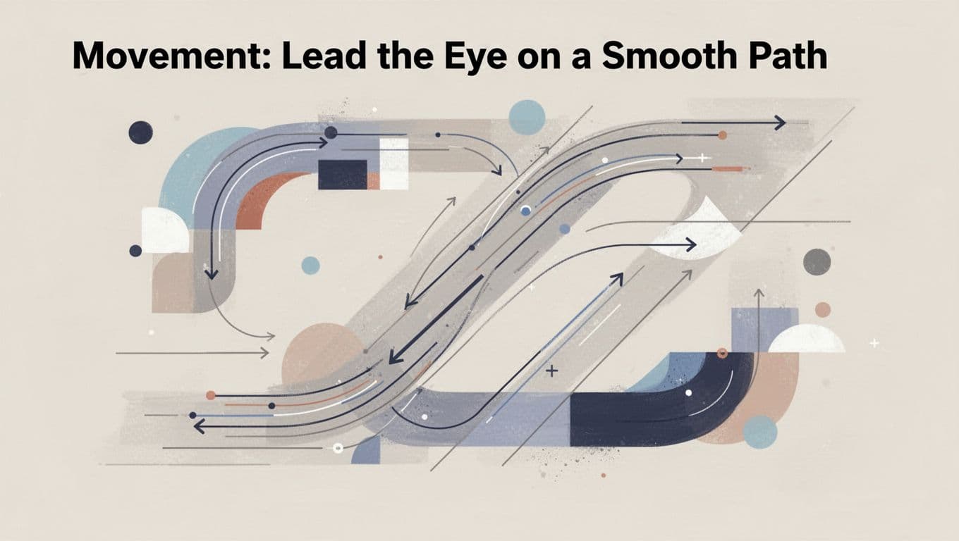
Movement: Lead the Eye on a Smooth Path
Movement directs gaze with lines or arrows. Z or F paths suit web. Curves flow like roads in posters.
Trace with your finger. Does it glide? Viewers stay longer. Stagnant designs bore.
Rhythm: Repeat with Twists for Lively Energy
Rhythm repeats like beats. Vary size or angle. Wavy lines grow bolder. Boredom fades.
Layouts pace better. Music analogies help. Steady repeats build groove.
Unity: Make All Pieces Feel Like One Whole
Unity binds with matching colors, fonts, space. Nothing fights. Brands stay consistent across cards.
Step back. Does it cohere? Scattered parts weaken messages.
Repetition: Reuse Elements to Strengthen Your Message
Repetition reuses bullets or motifs. Familiarity builds trust. Infographics echo colors.
Don’t flood. Subtle strength reinforces brands.
Pattern: Mix Repeats and Variety to Spark Interest
Patterns tile with tweaks. Dots shift size. Texture adds without chaos.
It fights dull flats. Repetition gains life.
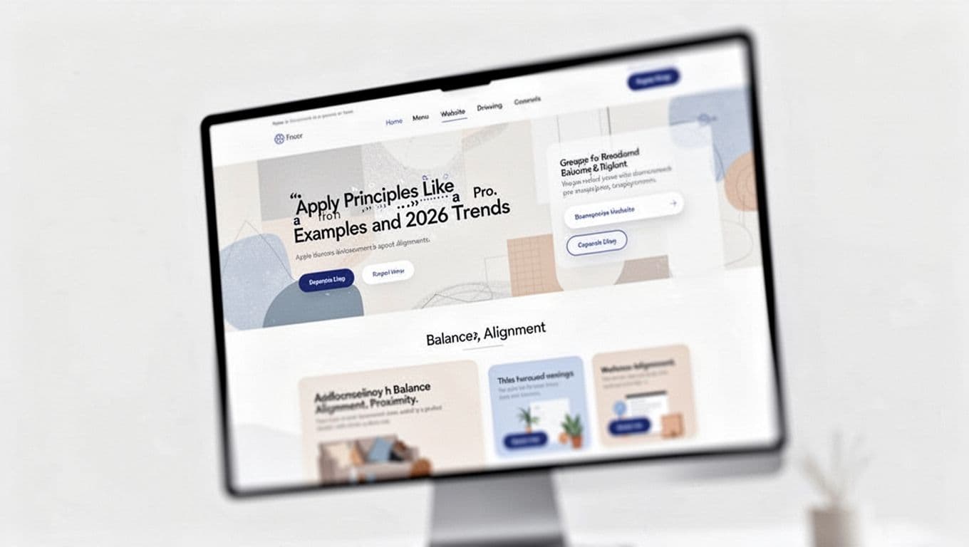
Apply Principles Like a Pro: Examples and 2026 Trends
A modern website nails several. Balance evens hero images and cards. Alignment grids text. Proximity groups menus tight.
Redesign a flyer step by step. Sketch rough. Balance weights. Add contrast pops. Feedback sharpens.
Early 2026 trends mix organic hand-drawn shapes with wobbly edges. Low-contrast calms with soft tones. Maximalist layers stack bold chaos for fun. AI tools spit ideas fast, but principles keep quality high. See 2026 trends details here. Sketch first. Use Canva free.
Balance evens weights. Contrast pops differences. Emphasis spotlights stars. Alignment cleans paths. Proximity links items. Movement guides eyes. Rhythm varies repeats. Unity binds wholes. Repetition builds trust. Pattern adds spark.
They shine together. Practice on business cards or Instagram. Which principle clicks most? Comment below. Subscribe for tips, tools, and trends.