Picture this: a plain logo sits unnoticed. You swap gray for fiery persimmon orange. Suddenly, it goes viral. Color does that. It grabs eyes, stirs emotions, and drives clicks.
You know the frustration. Your designs feel flat. Viewers scroll past. Color fixes it fast. It builds trust, sparks joy, or pushes sales. This guide shows you how. You’ll master theory basics, pick killer palettes, apply colors smartly, and skip traps.
We cover timeless rules plus 2026 trends like neon boosts and earthy neutrals. By the end, your work will pop. Ready to turn heads?
Master Color Theory Basics for Designs That Wow
Color theory gives your designs a solid base. Without it, picks feel random. With it, everything clicks. Start here to build confidence.
You avoid guesswork. Famous brands prove it. Coca-Cola picks red for energy. It excites buyers every time. Now, you can too.
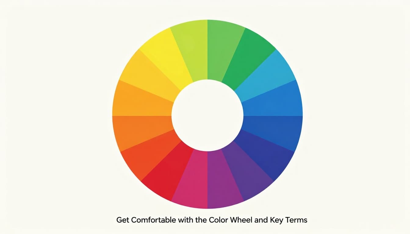
Get Comfortable with the Color Wheel and Key Terms
The color wheel spins like a pizza divided into slices. Primaries sit at the core: red, yellow, blue. They mix into secondaries like green or purple. Tertiaries fill the gaps, such as red-orange.
Hue names the pure color. Saturation sets the intensity, like full-strength paint versus watered-down. Value controls lightness or darkness. Think black coffee to cream swirl.
Warm colors cluster on one side: reds, oranges, yellows. They energize and advance forward. Cool ones oppose: blues, greens, purples. They calm and recede.
Spot complements across the wheel for bold pops. Neighbors make analogs for smooth blends. Grab Adobe’s color wheel tool to play. It shows harmonies instantly. Practice pulls it together.
Unlock Color Harmonies That Make Elements Sing Together
Harmonies keep colors friends, not foes. Analogous schemes use neighbors. Blues and greens flow calm, perfect for spa sites.
Complementary pairs opposites. Red and green contrast sharp. Use them for buttons that beg clicks. Triadic picks every fourth slice. It balances energy, like orange, purple, green in kids’ apps.
Each has strengths. Analogous soothes; complements grabs; triadic energizes. Limit to three to five colors. Too many clash.
Start simple. Pick a base hue. Build from there. Your designs gain rhythm. Viewers stay longer.
Select Palettes That Fit Your Project and Captivate Viewers
Palettes set the mood. Match them to your goal. Blues build trust for banks. Oranges amp fun for shops.
Tools speed this up. Coolors generates fast. Canva offers templates. Test shades side by side.
In 2026, trends mix bold hits with soft bases. Pinterest data shows persimmon rising. Pair it with cool blues for punch.
Before you dive deeper, here’s a quick table of hot palettes. They draw from real-time predictions.
| Palette Name | Key Colors (Hex) | Best For |
|---|---|---|
| Vibrant Persimmon Boost | #FF5C34 (Persimmon), #D7EFFF (Cool Blue) | Buttons, hero sections |
| Eco Neutral | Olive (#808000), Rich brown (#8B4513) | Sustainable backgrounds |
| Bold Gradient | Electric blue (#00BFFF), Deep orange (#FF8C00) | Interactive gaming sites |
| Muted Luxe | Plum Noir (#4B0082), Wasabi (#ADFF2F) | Fashion UI with depth |
These work because brights energize. Neutrals ground them. Always tweak for your brand.
Align Colors with Your Brand Story and Audience Needs
Know your crowd first. Young users love vibrant pops. Pros want clean trust.
Psychology guides it. Red pushes action. Green calms. Orange sparks play.
For wellness apps, pastels soothe. Retail sites go bold orange. What vibe fits yours?
Test moods. Sketch options. Pick what matches your story.
Tap into 2026 Color Trends for Fresh, On-Point Designs
Data from Figma and Pinterest spot risers. Persimmon (#FF5C34) surges 100% in searches. It brings warmth and fire.
Cool Blue (#D7EFFF) calms at 85% up. Jade greens and Plum Noir add depth. Wasabi greens zing as accents.
Earth tones like olive and taupe ground designs. Bolds like electric blues pop in gradients.
| Trend Type | Key Colors | Best Uses |
|---|---|---|
| Bold Vibrant | #FF5C34, #00BFFF | Retail, youth brands |
| Earthy Neutral | Olive #808000, #8B4513 | Eco sites, apps |
| Muted Luxe | #4B0082, #ADFF2F | Luxury UI, fashion |
They boost energy or trust. Mix sparingly. Check Venngage’s generator list for more tools.
Apply Color Strategically to Elevate Your Entire Design
Theory meets practice now. Use color to guide eyes. Follow the 60-30-10 rule. Sixty percent dominant color sets base. Thirty percent secondary supports. Ten percent accent highlights.
Hierarchy shines. Dark headers stand out. Light bodies read easy. Gradients add depth without chaos.
Print needs bold inks. Digital favors screens. Test both.
Build Visual Hierarchy and Flow with Color Choices
Eyes hit brightest first. Saturate key spots. Nav in steady blue. Hero accent in orange.
The 60-30-10 keeps balance. Users scan faster. Engagement climbs.
Example: E-commerce page. Base neutral. Category orange. Cart red. Flow feels natural.
Prioritize Accessibility So Everyone Loves Your Design
Contrast matters. WCAG demands 4.5:1 for text. Light text on dark passes. Pastels on white fail.
Use WebAIM-style checkers. They flag issues quick.
High-contrast neons from 2026 trends help. Inclusive designs rank higher. Users stick around.
Fixes simple. Swap low-contrast pairs. Test large text too.
Harness Color Psychology to Spark the Right Emotions
Brights like persimmon fuel vitality. Earth tones build realness. Pastels serene.
Apps use it. Button to persimmon; clicks rise. A/B test proves it.
Update for now. Saturated hues energize post-pandemic. Cool neutrals soothe screens.
Dodge These Sneaky Color Mistakes That Tank Your Designs
Errors sneak in. Spot them early. Your work stays sharp.
Overuse creates chaos. Culture blindsides. Contrast hides text. Trends distract. No tests confirm fails.
Quick audit: Limit palette. Check global means. Measure ratios. Purpose first. User test last.
Spot and Fix Overuse or Clashing Color Chaos
Rainbows overwhelm. Viewers bounce.
Stick to harmonies. Anchor with neutrals. 2026 vibrants shine paired right. Before: clash fest. After: clean pop.
Overcome Cultural and Accessibility Oversights
White means purity here. Mourning elsewhere.
Test diverse groups. Always hit contrasts. Beta users catch blindsides.
Inclusive wins loyalty. SEO follows.
Great color turns good designs unforgettable. You’ve got the basics: theory, palettes with 2026 hits like persimmon and jade, smart application, and pitfall dodges.
Pick one project today. Swap a color. Watch it transform.
Share your before-and-after in comments. What trend will you try? Subscribe for more tips. Your designs deserve to shine.