Picture this: you hand someone a flyer crammed with clashing colors and tiny fonts. It lands in the trash. Now swap it for a clean app screen with bold headings and smooth flow. That one sticks. Users judge designs in seconds. A professional design builds trust fast because it feels intuitive and polished.
In 2026, pro looks blend basics like smart colors and layouts with fresh ideas from AI tools. These elements guide eyes smoothly and spark confidence. Amateur work distracts; pros deliver calm focus. You want your sites, apps, or prints to convert viewers into fans.
This post breaks it down. First, master timeless principles for instant credibility. Next, add 2026 trends to stay modern. Finally, sidestep pitfalls that scream rookie. You’ll walk away with steps to upgrade your work right now.
Master the Timeless Principles That Give Designs Pro Polish
Core rules never fade. They create that premium feel users crave. Colors draw eyes right. Fonts set tone without effort. Layouts lead naturally. Consistency ties it all together. Nail these, and your design shouts expertise.
Designers rely on them for good reason. They boost readability and retention. In a busy world, clear visuals win attention. AI speeds up choices now, but humans pick the winners.
For deeper basics, check this visual guide to graphic design principles.
Pick Colors That Pop and Stay Readable
Start with a tight palette. Limit to three or four hues. High contrast keeps text sharp against backgrounds. Dark blue with white text works because it conveys trust and stays easy on eyes.
Psychology plays in too. Blues calm viewers. Greens signal action. Tools suggest matches based on mood. Always test for readability. Low contrast fails fast; text blends and frustrates.
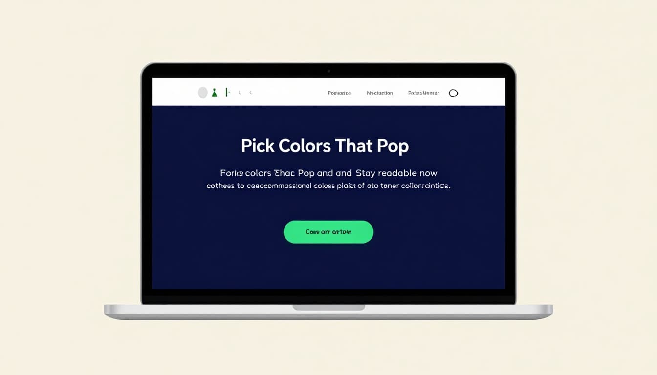
This setup grabs focus. White space around colors adds punch. Dopamine hits from bright accents keep users engaged. Result? Designs that load trust in one glance.
Use Typography to Guide Eyes and Set the Mood
Pick two fonts max. One for headers, one for body. Bold weights draw eyes to key spots. Sizes create steps: huge titles, medium subs, small details.
Readable fonts win. Sans-serif suits screens because they stay crisp. Pair a sculptural header with clean body text. It sets energy without chaos.
Hierarchy shines here. Big bold pulls first. Then subs explain. For tips on web text, see best practices for readability.
Users scan fast. Smart type leads them. Mood follows: playful curves for fun brands, strict lines for finance.
Craft Layouts with Clear Hierarchy and Flow
Grids guide but bend for interest. Center key elements. Off-center adds life, yet keeps balance. White space breathes; pack nothing tight.
Visual hierarchy rules. Size, color, position signal order. Eyes hit hero first, then calls to action. Explore how it boosts user experience.
Flow matters. Lines and gutters pull views down naturally. Even spacing avoids cramps. Users stay longer because paths feel effortless.
Ensure Consistency to Build Instant Trust
Repeat choices across screens. Same colors, fonts, button styles. It signals polish and care.
Pages match; brands unify. AI design systems automate this now. One change updates all. Trust grows because nothing jars.
Viewers relax into familiar patterns. Inconsistency hints slop. Stick to rules, and pros emerge.
Tap into 2026 Trends for That Next-Level Professional Edge
Trends keep designs fresh. In 2026, AI leads but serves humans. Subtle moves delight. Accessibility includes all. Depth adds touch without overload.
These build on basics. They lift engagement and fit every user. Skip flash; pick purpose. For shifts ahead, read about UX design trends shaping products.
Designs win when they adapt smartly. Users expect more now.
Leverage AI Tools to Speed Up Smart Choices
AI suggests layouts and colors fast. Prompt for palettes; refine by hand. It handles grunt work so you focus on feel.
Personalization shines. Interfaces tweak per user. Yet keep human oversight. AI builds; you shape.
Tools like Canva Magic iterate quick. Deeper thinking sets pros apart. Surface looks lose to thoughtful systems.
Add Subtle Motion That Delights Without Distracting
Micro-moves clarify. Buttons lift on hover. Scrolls reveal info smooth.
Gestures sense needs. Zero UI hides screens sometimes. Voice or touch takes over.
Keep it light. Motion boosts perceived speed. Overdo, and it tires eyes. Purpose guides every tween.
Prioritize Accessibility for Everyone
Contrast meets WCAG. Dark modes standard. Keyboard nav works seamless.
Design for ADHD too. Pause plays. Minimal modes calm chaos. Inclusivity ups usability.
Everyone wins. Metrics prove it: wider reach, better retention.
Incorporate Tactile 3D and Glass Effects
Layers add depth. 3D models spin real. Glassmorphism blurs soft.
Mix with minimal. Textures engage touch sense. Anti-design clashes bold but accessible.
Immersive scrolls pull users in. IKEA-style previews sell. Modern yet grounded.
Dodge These Common Mistakes That Scream Amateur
Pitfalls kill polish quick. Clutter buries messages. Trends without plan flop.
Fix them simple. Pros spot and swap. For fixes on print woes, see design mistakes that scream amateur.
Stay clean; level up.
Don’t Let Clutter or Over-Motion Ruin Your Hierarchy
Stuff fights flow. Trim ruthless. Motion serves or sits.
Hierarchy dies in noise. Guide eyes clean. Space rules.
Skip Weak Colors and Inaccessible Features
Low contrast hides text. Test always. WCAG basics save.
Ignore, and users bounce. Safe choices win broad.
Avoid Mashing Trends Without a Plan
Pick fits. Consistency trumps hot. Goal first.
Chaos looks try-hard. Unified trends pro.
Timeless principles form the base. Layer 2026 trends like AI aids and subtle 3D for edge. Dodge clutter and weak access; clean wins.
Audit one design today. Swap fonts or tweak space. Small shifts build pro vibes.
Share your before-after in comments. Try an AI tool now. Subscribe for more 2026 tips. Your next design awaits that polish.