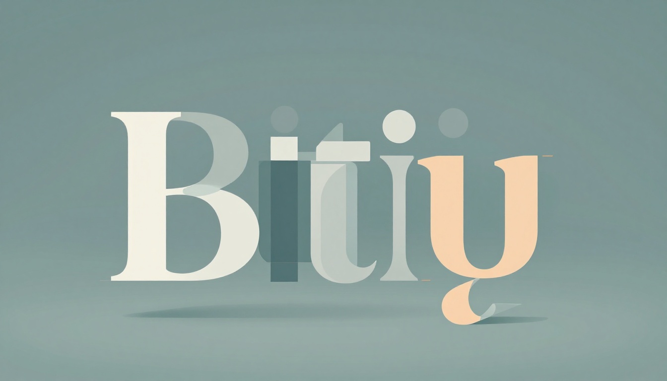
Ever stared at a restaurant menu with tiny, squished text and felt your eyes glaze over? Now picture the same menu in clean, spacious letters that draw you right in. That’s typography at work: the art of arranging type to make words readable and appealing.
You see it everywhere, from websites to signs. Poor choices make content hard to scan. Good ones guide your eye effortlessly. In this post, you’ll learn letter parts, font types, key rules, common pitfalls, and 2026 trends. By the end, spot strong type anywhere and use it in your own work.
Break Down the Anatomy of Every Letter
Typeface means a complete family of letters, like all weights of Helvetica. Font refers to one style, such as bold Helvetica. Knowing these parts helps you pick fonts that match your needs.
Here are core elements:
- Baseline: The invisible line letters rest on, like feet on the ground.
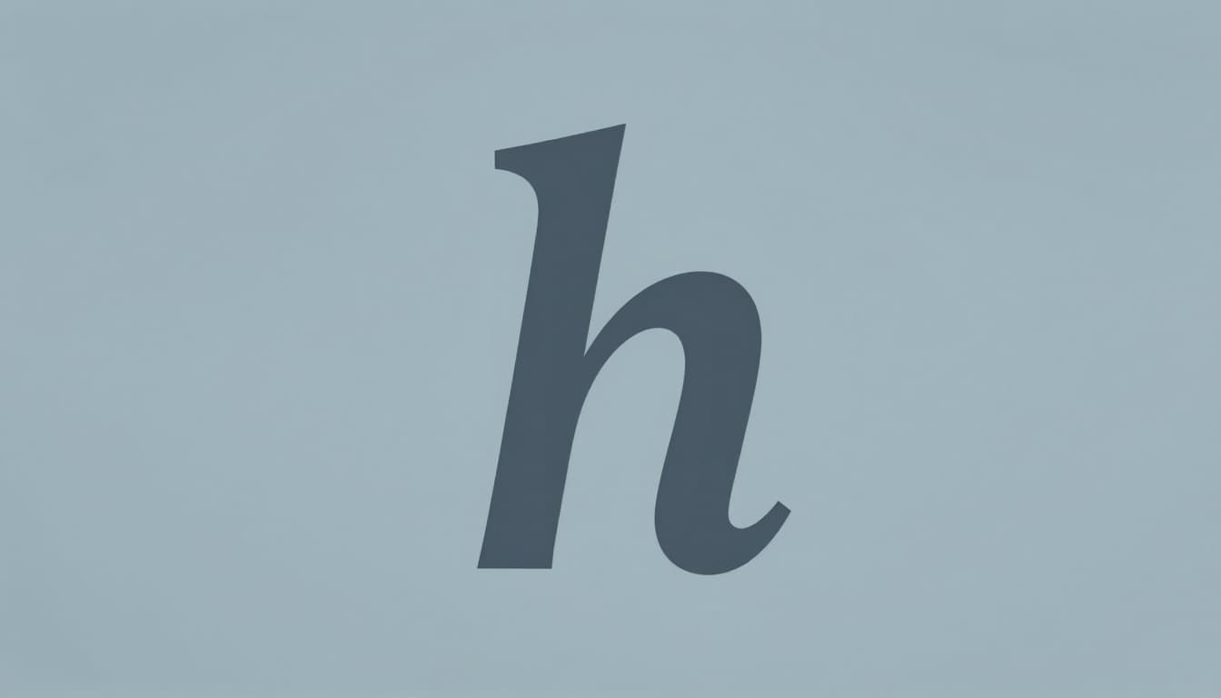
- Ascender: Tall parts above the x-height, as in “b” or “h”.
- Descender: Parts that drop below the baseline, like tails on “g” or “p”.
- X-height: Height of a lowercase “x”; it sets the feel for most small letters.
- Cap height: Top of uppercase letters.
- Stem: Main vertical stroke, thick or thin.
- Serif: Small lines at stroke ends.
- Skeleton: Basic inner shape.
- Axis: Imaginary line through curves, showing slant.
For visuals on these, check Figma’s typeface design guide.
Baseline to X-Height: The Foundation of Readability
Baseline keeps letters aligned. Ascenders add height to letters like “d”. Descenders create balance below.
X-height affects density. A small one, like in some old-style fonts, makes text feel cramped. Larger x-heights, common in sans-serifs, open up space. Cap height stays consistent across fonts. These traits ensure smooth reading flow. Inconsistent heights distract the eye.
Stems, Serifs, Skeletons, and Axes: What Gives Letters Personality
Stems form the backbone, as in the straight line of “l”. Serifs add feet or brackets, guiding eyes in print.
Skeleton is the core form without extras. Axis shows tilt: vertical for upright fonts, angled for italics. For example, a round “o” has a straight axis; an italic one slants. Serifs suit books. Sans-serifs shine on screens because they stay crisp.
Choose Fonts That Fit: Serif, Sans-Serif, and More
Fonts fall into groups based on style. Match them to your goal. Serifs work well for print. Sans-serifs excel online.
Pair a serif body with sans-serif headings. Limit to two or three total.
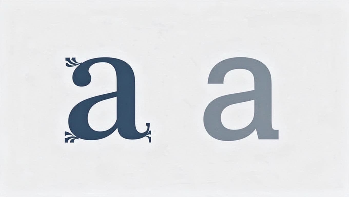
Serif Fonts: Your Go-To for Books and Print
Serifs are small strokes at letter ends. They lead the eye across lines in long text. Think Times New Roman in novels.
These fonts feel traditional and trustworthy. Use them for body text in magazines or ebooks. Avoid on low-res screens, though.
Sans-Serif Fonts: Perfect for Screens and Modern Looks
No serifs mean clean edges. Arial and Helvetica read sharp on phones and sites. For more on choices, see Adobe’s serif vs sans-serif guide.
They suit headings or all-digital work. Modern brands pick them for simplicity.
Slab Serif, Script, and Display: When to Get Creative
Slab serifs have thick feet, great for ads. Scripts mimic handwriting; save for invites. Display fonts grab attention in titles.
Use these sparingly. They overwhelm body text. Test for legibility first.
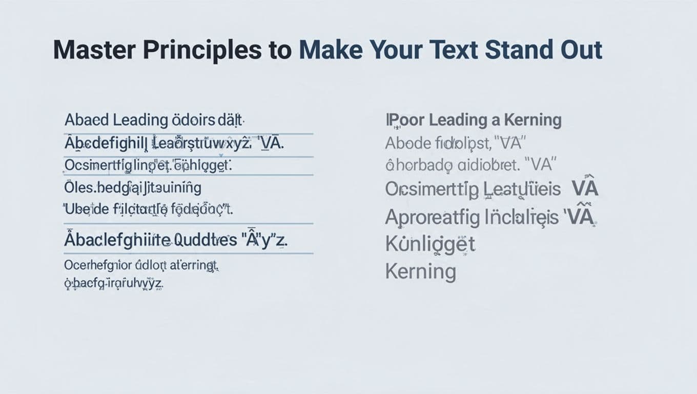
Master Principles to Make Your Text Stand Out
Hierarchy orders info: big titles first. Sizes draw focus. Leading adds space between lines.
Kerning adjusts tight pairs like “AV”. Tracking loosens overall. Align left for bodies. Contrast mixes weights. White space breathes.
| Principle | What It Does | Quick Tip |
|---|---|---|
| Hierarchy | Guides reader path | H1 largest, body smallest |
| Size/Weight | Highlights key parts | Bold for emphasis |
| Leading | Spaces lines | 1.5x font size |
| Kerning | Fixes letter pairs | Check “VA”, “WA” |
| Alignment | Keeps text neat | Left for paragraphs |
Create Hierarchy and Play with Size and Weight
Start with large, bold H1 for mains. Shrink to H2, then body. Readers scan fast, so make paths clear.
Weights add punch. Light for quotes, heavy for calls.
Nail Spacing with Leading, Kerning, and Tracking
Tight leading cramps lines. Set it at 1.5 times size for air. Kerning evens gaps in logos.
Tracking widens families. Test on screen; print needs tweaks.
Use Alignment, Contrast, and White Space Wisely
Left alignment suits English. Keep lines 50-75 characters. Mix light and bold for pop.
Generous margins prevent clutter. Phones demand short lines.
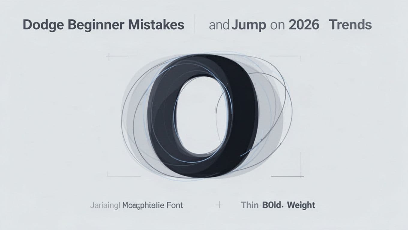
Dodge Beginner Mistakes and Jump on 2026 Trends
Newbies grab too many fonts. Spacing suffers. Text shrinks too small. Screens get ignored. Contrast fades. Fits feel forced.
Fixes: Limit fonts. Add space. Scale up. Test devices. Boost differences.
Common Traps That Make Designs Look Amateur
Five fonts confuse. Poor kerning screams sloppy; adjust pairs. Tiny sizes strain eyes; go 16px minimum. Serifs flop online; swap to sans. No contrast blends all.
Add space. Test prints and screens.
2026 Trends: Variable Fonts and Animated Text
Variable fonts shift weights in one file. They load fast and flex smooth. March data shows bold displays, handwritten organics, and retro vibes rising.
Motion type animates flow. Messy textures feel human. For picks, see trending fonts in 2026. Experiment, but keep readable.
You now grasp letter anatomy, smart picks, principles, fixes, and trends. Practice on flyers or sites with Google Fonts.
Great type lifts content. Share your first try in comments. What font will you test next?