Picture Apple’s product pages. Clean layouts draw your eyes straight to the device. Or Nothing’s homepage, where huge empty areas spotlight gadgets. These sites use white space and smart layouts to feel calm and focused.
White space means empty areas around elements. Negative space shapes how we see forms. Layout arranges everything for smooth flow. In 2026, good spacing cuts user confusion and boosts trust, with studies showing up to 30% higher engagement from scannable designs.
You will learn basics, principles, trends, pitfalls, and tools. Simple tweaks make your work stand out. Let’s dive in.
Master White Space to Make Your Designs Feel Alive
White space acts like breathing room. It surrounds key elements to highlight them. Think of SingleStore’s site, where bold spacing builds confidence.
This space shapes perception. Empty areas form implied shapes or paths. Benefits include less overload and a luxury vibe. Focus sharpens on what matters.
Imagine a fridge with room between items. You grab food fast. Designs work the same way. In 2026, designers shift to purposeful space, not just empty minimalism.
Start simple. Double margins around headlines. This creates calm or energy, depending on your goal. Space pulls emotions without words.
Spot the Difference: White Space vs Negative Space
White space covers any empty spot. Negative space defines shapes actively. For example, a logo’s background forms a hidden arrow.
Both guide attention silently. Check Layout Scene’s guide on white space principles for clear examples. You see how space turns flat designs into stories.
In short, white space clears clutter. Negative space adds clever illusions.
Why Generous Space Wins User Hearts Every Time
Space lowers cognitive load. Users navigate easier. It builds trust with a pro look.
Accessibility improves too. Bigger gaps help shaky hands or bright screens. 2026 data ties organized space to professional feels and fewer bounces.
Results show 20% better button visibility. Engagement rises because eyes rest. For deeper tips, see Inkbot Design’s negative space practices.
Users stay longer. They click more. Space makes sites welcoming.
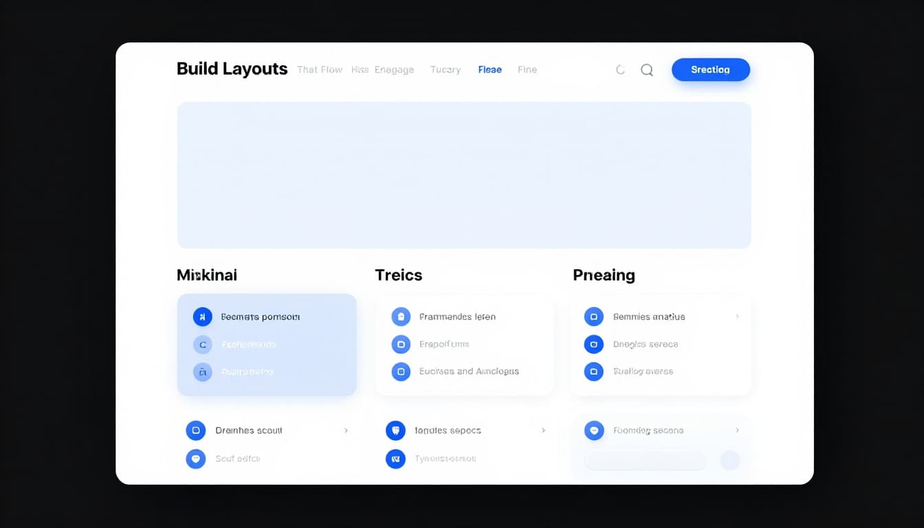
Build Layouts That Flow and Engage Naturally
Hierarchy starts with spacing. Big gaps separate sections. Tight clusters group related items.
Balance mixes full and empty areas. This adds warmth, not sterility. Grids align elements neatly, without stiff looks.
Match space to mood. Loose gaps suit calm luxury. Tight ones create urgency. Responsive setups flex across devices.
Figma handles auto-adjusts well. Space adapts for touch, voice, or mouse.
Create Hierarchy That Pulls Eyes Where You Want
Vary space sizes for importance. Large gaps signal top sections. Small ones around buttons make them pop.
This cuts wrong clicks. Navigation feels intuitive. Users find paths fast.
For instance, space a call-to-action button generously. Eyes go there first. Flow improves naturally.
Balance Your Canvas for That Perfect Harmony
Avoid extremes. Too empty feels cold. Crammed looks chaotic.
In 2026, add texture or grain to open spots. This warms things up. Balance keeps designs harmonious.
Test by stepping back. Does it feel right? Adjust until yes.
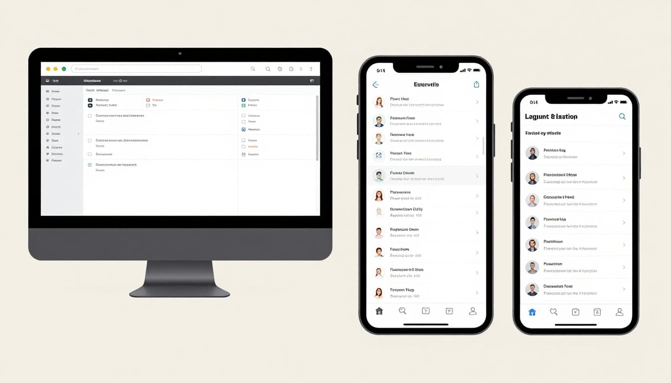
Go Responsive: Layouts That Shine on Any Screen
Test on real devices. Use 20-30px margins for mobile. Bump to 40+ on desktop.
Flexible grids prevent breaks. Tools like Figma shine here. See Figma’s layout grids best practices for setup.
Layouts adapt smoothly. Users love consistent experiences.
Ride 2026 Trends for Standout, Human Designs
Breathing minimalism leads, like Nothing’s style. Space feels cozy with handmade touches. Away from cold perfection.
Layer bold elements for personality. Vertical rhythm adds depth, like textured ceilings. Multimodal designs fit AR/VR.
These trends humanize screens. Check TinyFrog’s 2026 web trends for more.
Breathe New Life into Minimalism
Generous gaps around headlines pair with muted colors. Sophistication shines.
Focus stays sharp. Content breathes. Users engage deeper.
Add Imperfect Touches That Feel Real
Grain or scans break rigidity. They create cozy vibes over sterile ones.
Handmade feels build connection. Trends favor warmth now.
Dodge These Traps to Keep Your Designs Flawless
Purposeless space bores viewers. Ignore accessibility, and you lose users. Fixed layouts crack on mobile.
Static designs miss motion. Always ask why for each gap. Test with real people.
See Peasy Design’s whitespace mistakes to avoid common slips.
Don’t Let Space Sit Idle Without Purpose
Give space jobs: guide eyes, separate groups, or add luxury. No reason? Shrink or fill it.
Purpose keeps designs tight. Boring vanishes.
Make It Work for Everyone, Everywhere
Check contrast and gaps for accessibility. Go responsive and multimodal.
Test devices and users. Inclusive wins big.
Grab These Tools to Nail Space and Layout Fast
Grids speed alignment. Figma and Adobe XD offer flexible spacing.
Set base margins at 20-30px for mobile room. Duplicate your design. Tweak space, then compare.
Quick wins come fast. Experiment often.
| Tool | Key Feature | Best For |
|---|---|---|
| Figma | Auto-layout grids | Responsive prototypes |
| Adobe XD | Flexible margins | Quick spacing tests |
| Layout Grids | Alignment rules | Balanced canvases |
These simplify work. Results impress.
Space guides eyes. Layouts create flow. Trends add humanity. Skip pitfalls with purpose. Tools make it easy.
Audit one design today. Tweak the space. Watch the difference.
Share your before-and-after in comments. Subscribe for more tips. Great space turns good into unforgettable.