You pour hours into a design. It feels right on your screen. Yet clients or viewers skim past it. They call it amateur without a second glance.
In March 2026, AI tools flood the market. They spit out flawless layouts. But that perfection backfires. It lacks soul. People spot the robot touch and lose trust. Your work gets dismissed.
Common culprits include too-smooth edges, jammed elements, clashing fonts, wonky spacing, and bland images. Good news: simple tweaks fix these fast. You’ll learn actionable steps with free tools. By the end, your designs grab attention and build credibility.
Ditch the Too-Perfect Look for Designs That Feel Real
Super smooth designs ruled before. Now they scream AI. In 2026, viewers crave messiness. Brains pick up on zero flaws. It feels off, like the uncanny valley in faces. Sites with wobbly lines and textures win trust instead.
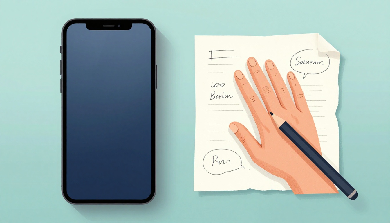
Start with paper sketches. Your hand adds natural shakes. Scan them in. Then layer digital effects. Torn paper textures hide perfection. Shaky lines mimic doodles. Grainy glitches or stitched borders feel handmade.
For example, a logo with wobbly serifs beats crisp ones. Or add low-ink fonts that look printed on old paper. These tricks counter AI vibes. They make work feel alive.
Check out Lotiva’s take on 2026 trends. They explain why perfect fails conversions.
Spot the Signs of AI Overkill in Your Work
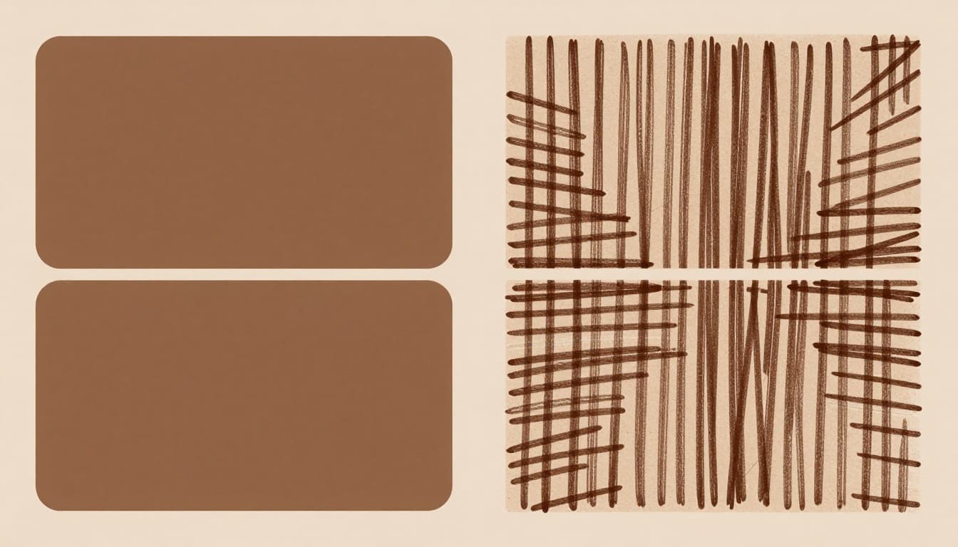
Look for symmetry everywhere. Perfect gradients lack bumps. Uniform edges show no wear. These scream machine-made. Viewers bounce because it feels fake.
Overly even spacing fits too neat. No overlaps or bends. Colors blend without grit. Test by zooming out. Does it look copied from a template? If yes, rework it.
Easy Ways to Add Human Flair Without Starting Over
Layer textures first. Use Photopea for free grain overlays. Shift elements off-center with the rule of thirds. Pick fonts like hand-scrawled ones.
In Figma, draw wiggly paths. Add asymmetry to buttons. Subtle noise filters break smoothness. Practice on copies. Results pop without full redesigns.
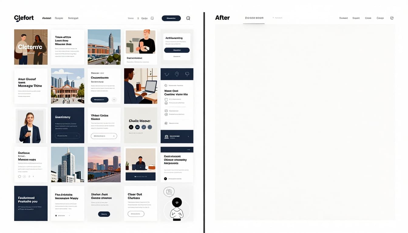
Clear Out Clutter to Let Your Message Shine
Too many icons, texts, and ads overwhelm eyes. Users confuse fast. Bounce rates spike. Recent data shows 84% of small sites cram too much. Another 38% of visitors leave from poor layouts.
Focus one message per section. White space guides focus. It boosts readability on phones, where most traffic hits. Conversions climb as a result.
Benefits stack up. Clean pages load quicker. Brands stick in minds with consistent colors. Mobile users stay longer.
See Onvert’s stats on clutter and conversions. They break down overload effects.
Why Overload Kills Your Design’s Impact
Visual chaos tires brains. Users scan in 50 milliseconds. Clutter signals untrustworthy. Studies link it to 79% task failures. Frustration builds. They click away.
Ecommerce pages suffer most, with 20-45% bounces from mess. Blogs hit 70-90%. Fix clutter to cut these numbers.
Smart Strategies for Breathing Room and Focus
Audit every element. Ask if it serves the goal. Delete extras. Apply white space rules: double gaps around headlines.
Split long pages into sections. Use icons sparingly. Test mobile views. Breathing room raises engagement 30-50%.
Pick Fonts and Colors That Grab Attention and Read Easy
Fonts clash or shrink too small. Colors fade into backgrounds. 79% of homepages fail contrast checks. Tiny text hits visual impairments hard.
Limit to two or three fonts. Bold headlines pair with clean body text. Blues build trust. Warm tones add energy. Always tie to brand.
Generate palettes with three to five shades. Test WCAG ratios. Mobile screens shift hues, so preview there. Short paragraphs scan easy.
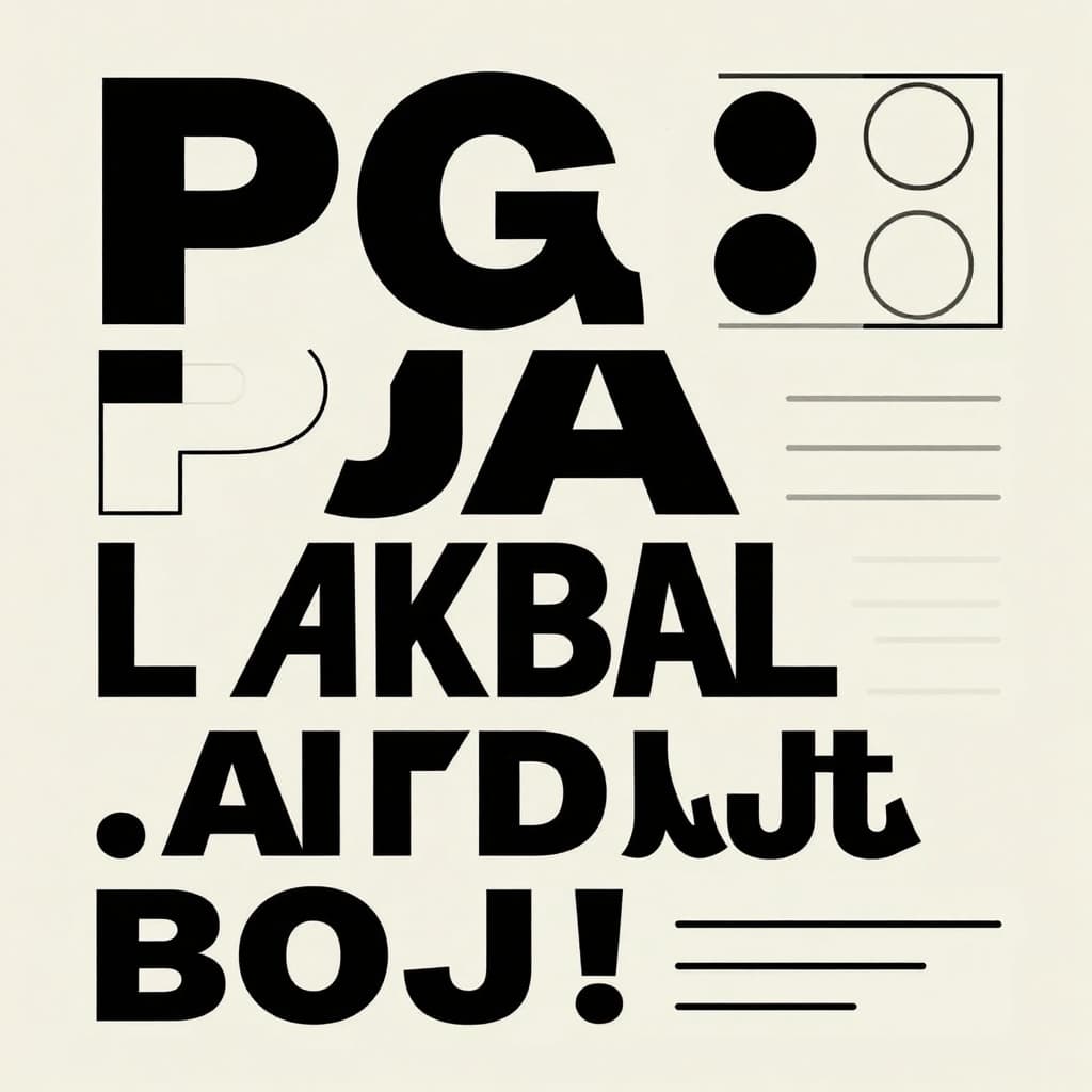
Typography Tricks for Effortless Readability
Pair serif headlines with sans-serif body. Like Playfair Display over Inter. Set sizes in hierarchy: 48pt heads, 18pt text.
Boost line spacing 1.5 times. Weights vary impact. Check Peasy Design’s pairing guide for combos.
Color Choices That Match Your Brand and Mood
Avoid harsh clashes. Subtle shifts feel human. Use Adobe Color for harmonies. Run contrast tools.
Accessibility lifts traffic 23%. Dark mode helps 72% of sites now.
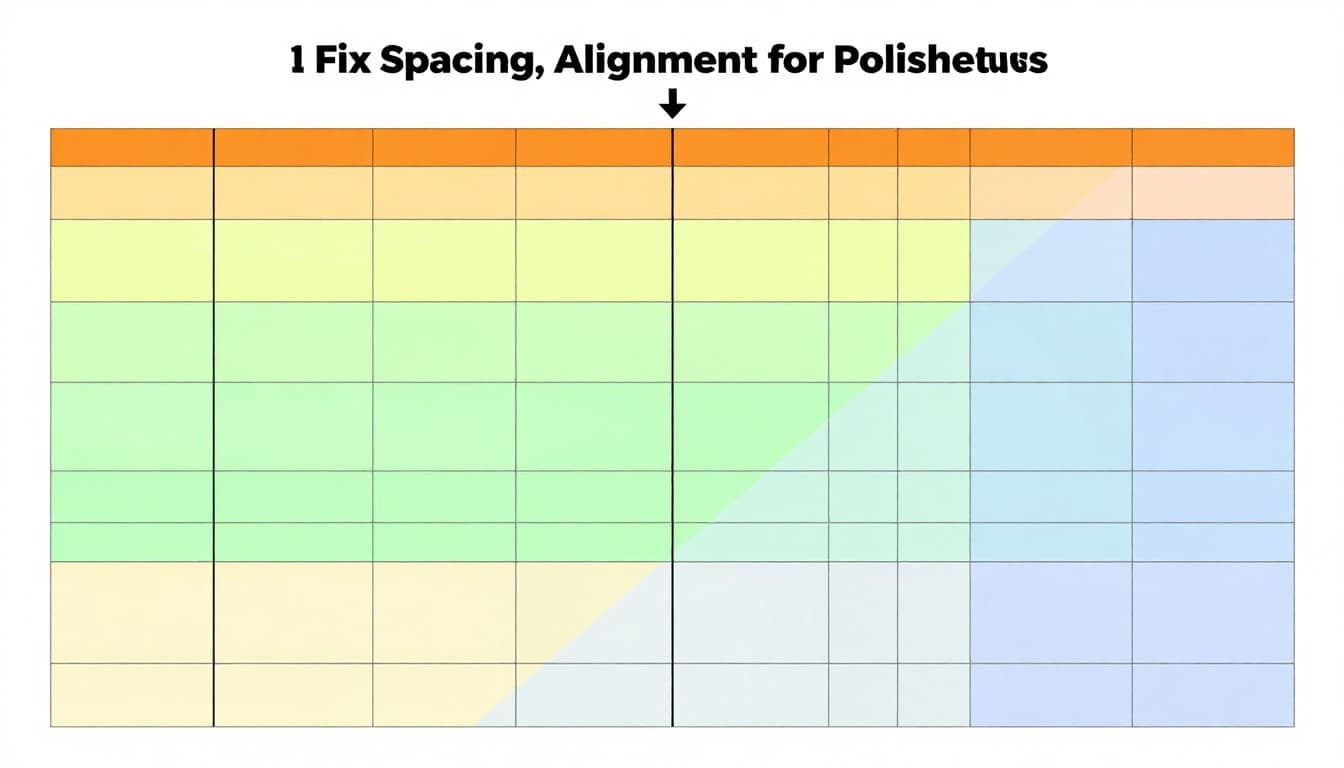
Fix Spacing, Alignment, and Flow for Polished Results
Crowded edges look sloppy. Uneven lines jar eyes. 60% of visits come mobile. Bad spacing spikes bounces 30-50%.
Snap to grids for straight work. Equal padding adds room. Rule of thirds balances off-center fun. Guide eyes top-down, left-right.
Size pops hierarchy. Colors pull focus. Phones demand tests to dodge 54% exits.
Alignment and Grid Basics Every Beginner Needs
Set up 12-column grids in Canva or Figma. Align baselines. Avoid random pixels. Pitfalls like tiny buttons frustrate taps.
Creating Hierarchy So Users Know What’s Important
Enlarge key elements. Position headlines top. Before: flat mess. After: clear path boosts sessions 30%.
Upgrade Images and Overall Consistency for Pro Vibes
Pixelated stock kills trust. 75% of viewers spot generics. They doubt credibility. High-res custom shots at 300 DPI shine.
Optimize for speed. Add glitch touches. Match styles site-wide. Mobile SEO favors fast loads.
Sourcing and Fixing Images That Wow
Skip stock traps. Shoot your own or edit in Photopea. Upscale carefully. Authentic wins shares.
Tools to Make It All Easy for New Designers
Grab Canva for starters. Figma prototypes free. Photopea edits like pro. Coolors spits palettes. See StackCompare’s free tool rankings. Sketch on paper first. Tackle one fix daily.
Imperfect touches beat AI shine. Declutter lets messages land. Smart fonts, colors, spacing, and images seal pro looks.
Pick one tip today. Redo a design. Quick wins build skills. Share your before-after below. Authentic work rules 2026. You got this.